Brightway Dental opened its doors with a vision to provide a fresh, patient-first approach to dentistry. As a brand-new practice, the team needed a name, logo, messaging, and identity that would reflect their modern care philosophy and welcoming atmosphere. UNANIMOUS began with brand naming, developing “Brightway” to convey clarity, optimism, and trusted guidance. From there, we built a cohesive brand guide that delivers consistency at every touchpoint.
Brightway Dental
Dental Office Brand Naming & Branding
Brand Naming
The first step in the branding process was creating a name that felt fresh, memorable, and reflective of the practice’s values. “Brightway” was developed to represent a clear path to better dental health. The name strikes a balance between professionalism and approachability, appealing to a wide range of patients while standing out in a saturated market.
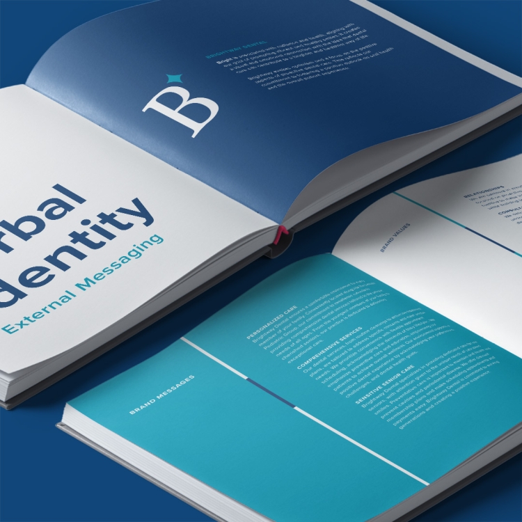
Verbal Identity
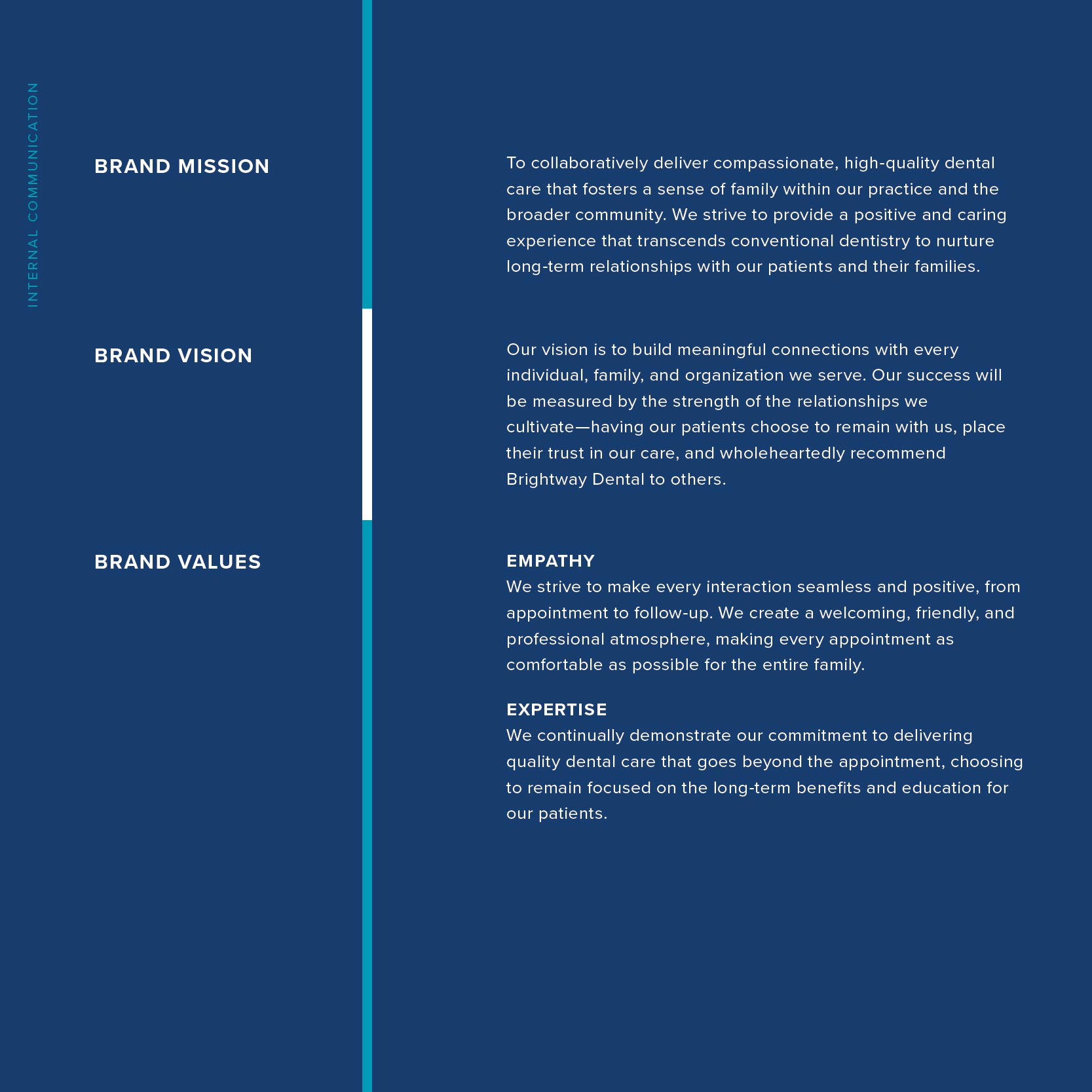
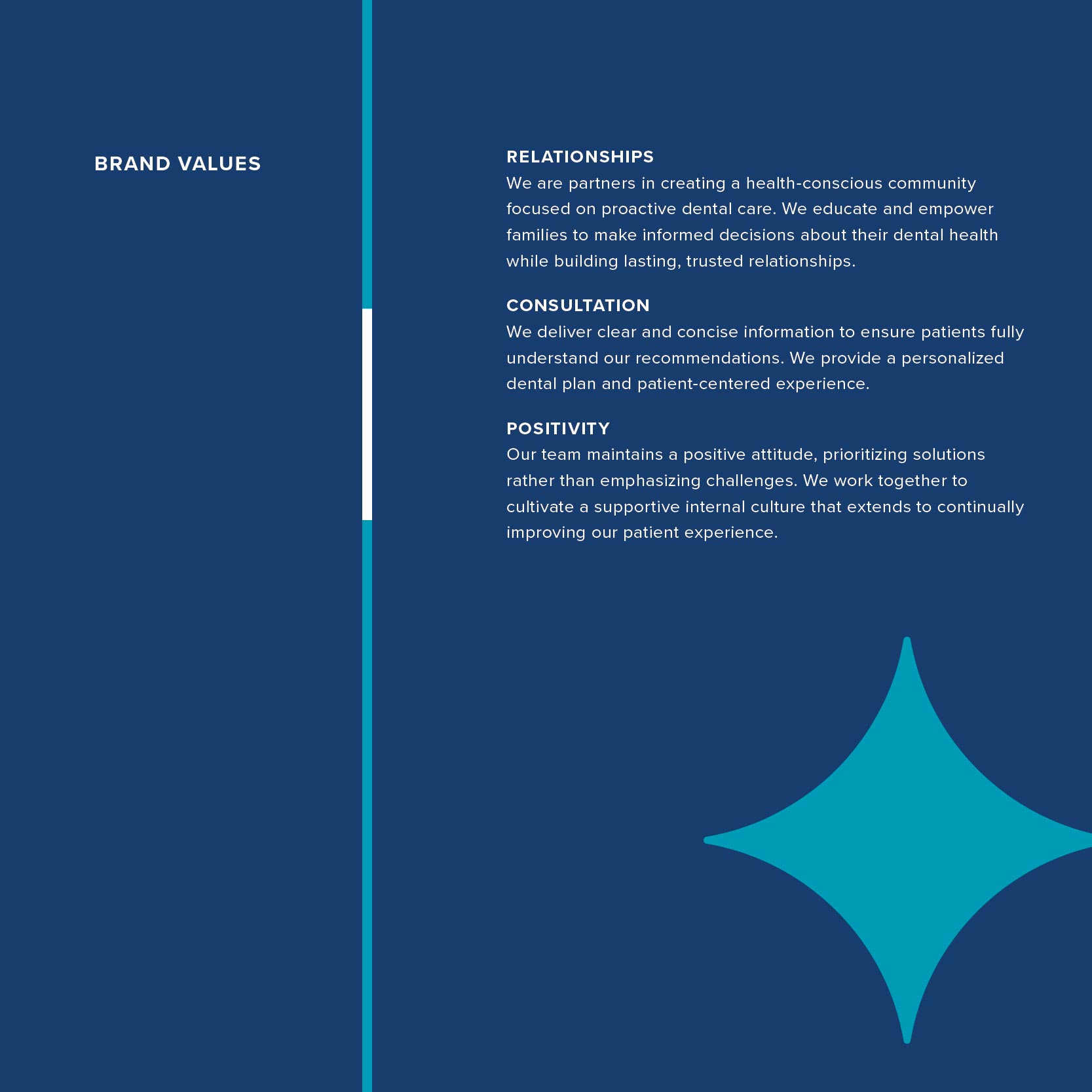
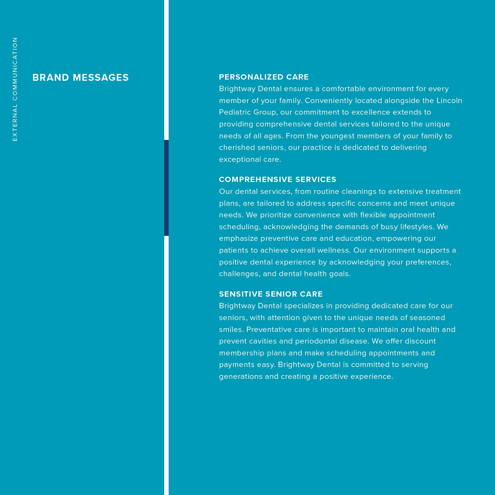
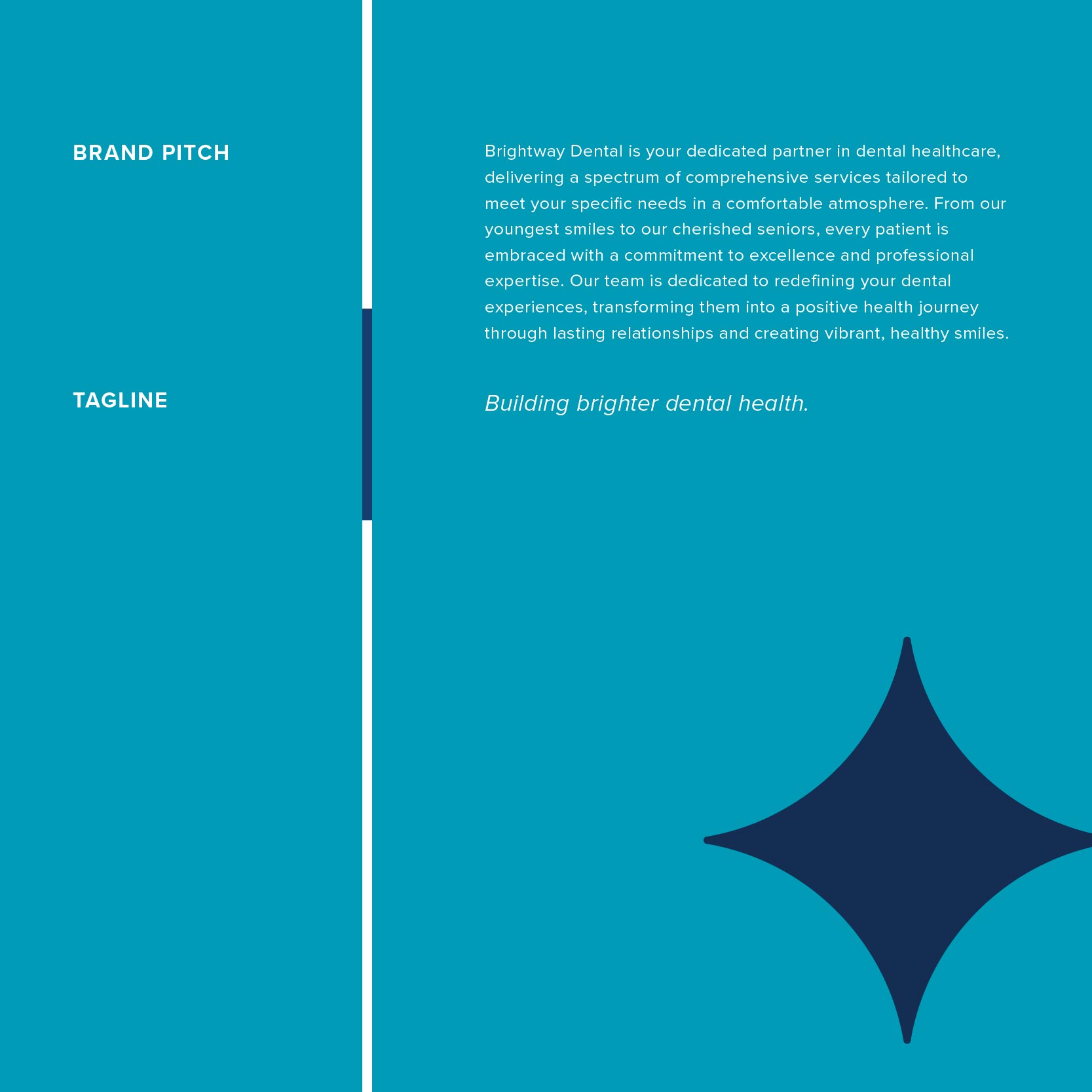
Brightway’s name reflects their promise: to guide patients to better dental health through a brighter, more positive experience. We developed messaging to bring that promise to life, including a tagline, positioning statement, and brand voice guidelines. The tone is calm and confident, with a focus on personalized care. Messaging highlights Brightway’s patient-first philosophy and reinforces their role as a trusted guide, not just a provider. Internal messaging supports team alignment, while external messaging builds trust with new and returning patients.
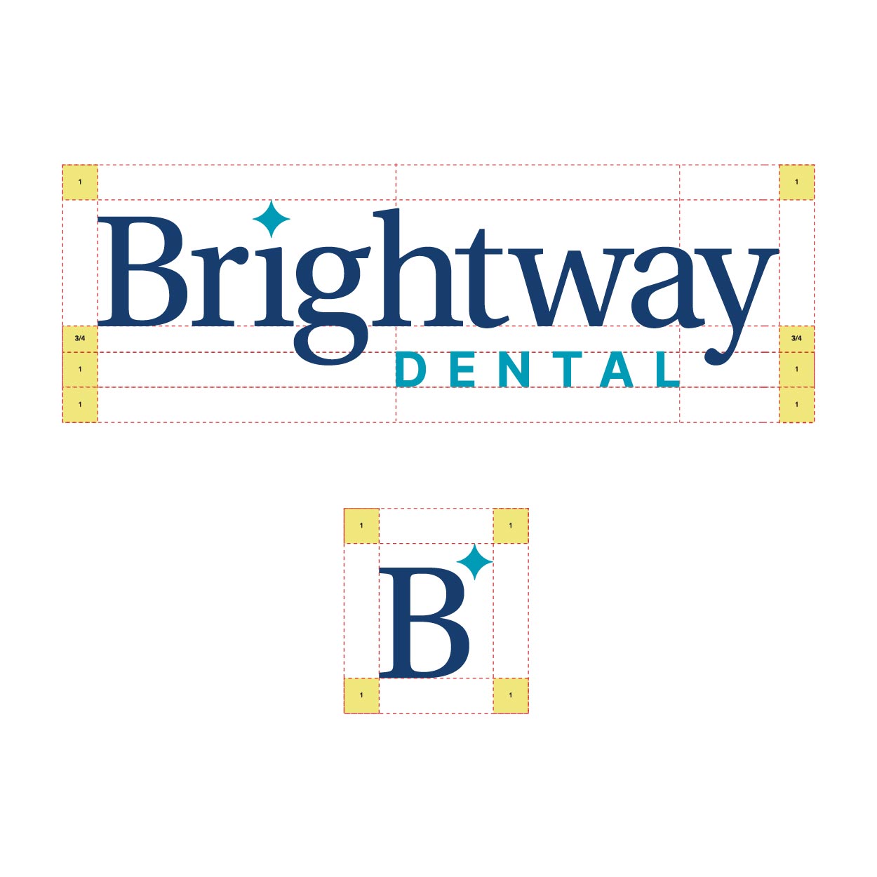
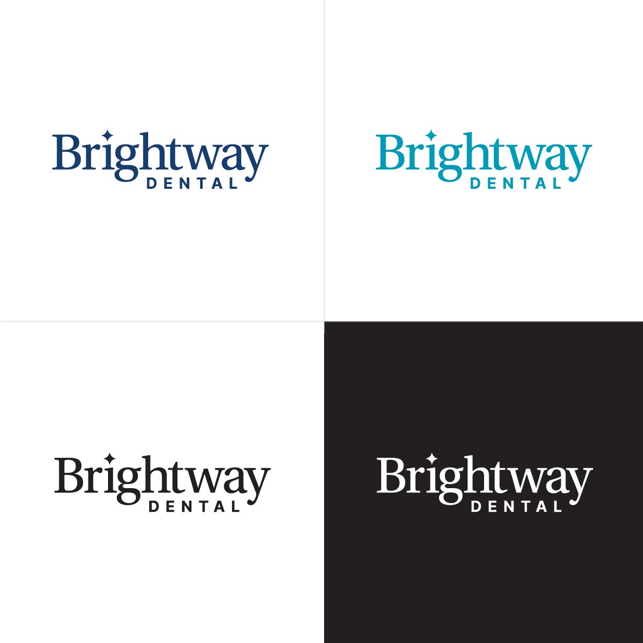
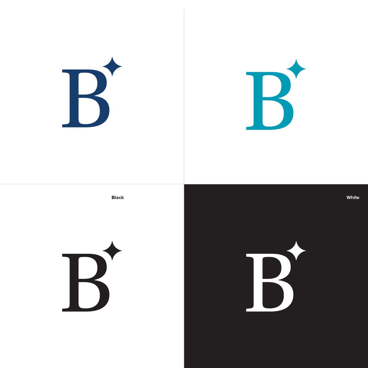
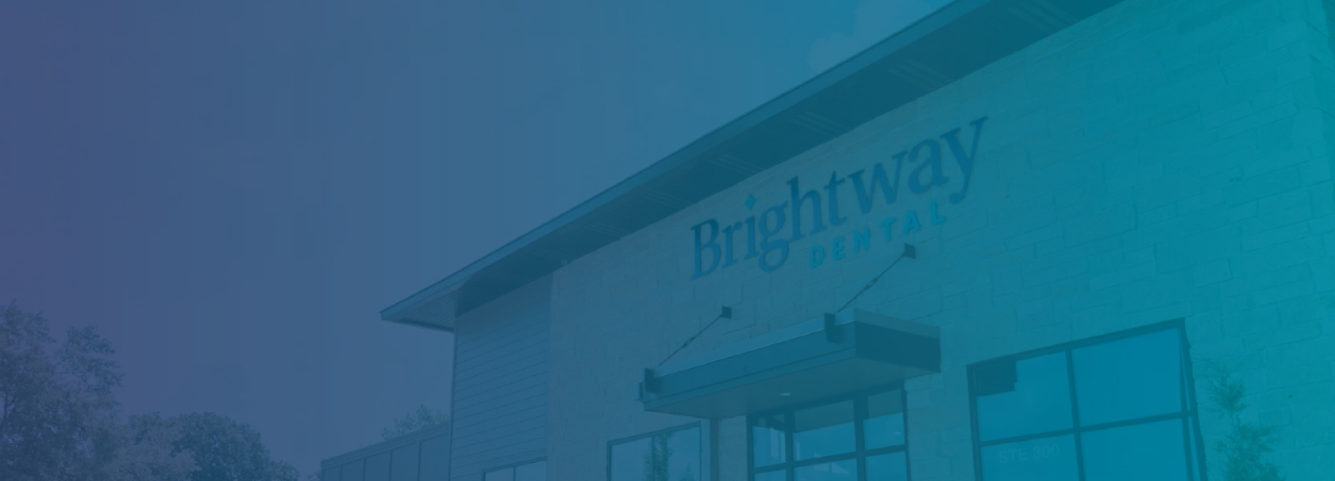
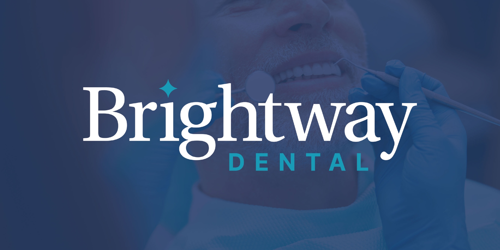
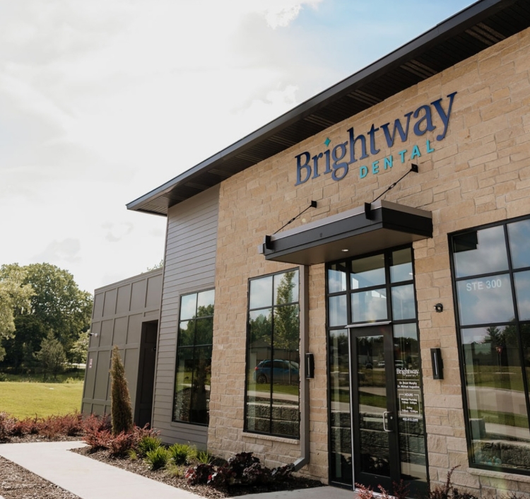
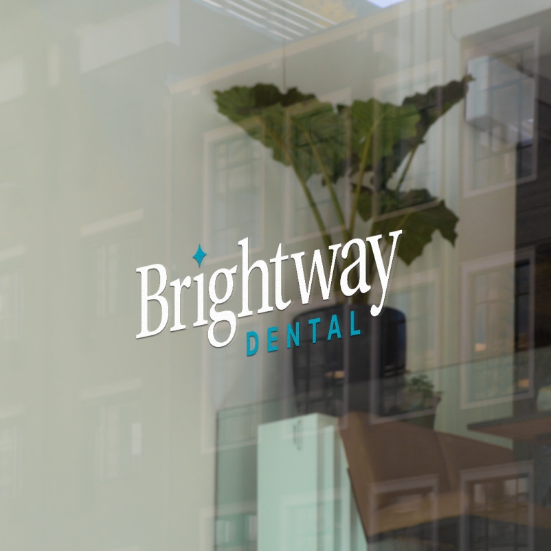
Logo Design
The Brightway Dental logo strikes a balance between professional and friendly. The custom wordmark features clean typography with a subtle curve, giving it a warm, modern feel that doesn't compromise its credibility. The design is approachable yet polished, just like the practice itself. It’s a logo built to stand confidently on a front door, a website header, or a business card, instantly recognizable and easy to trust.


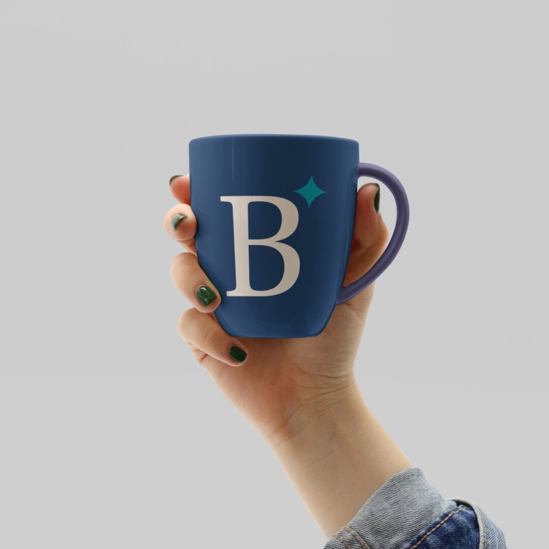
Visual Brand Identity
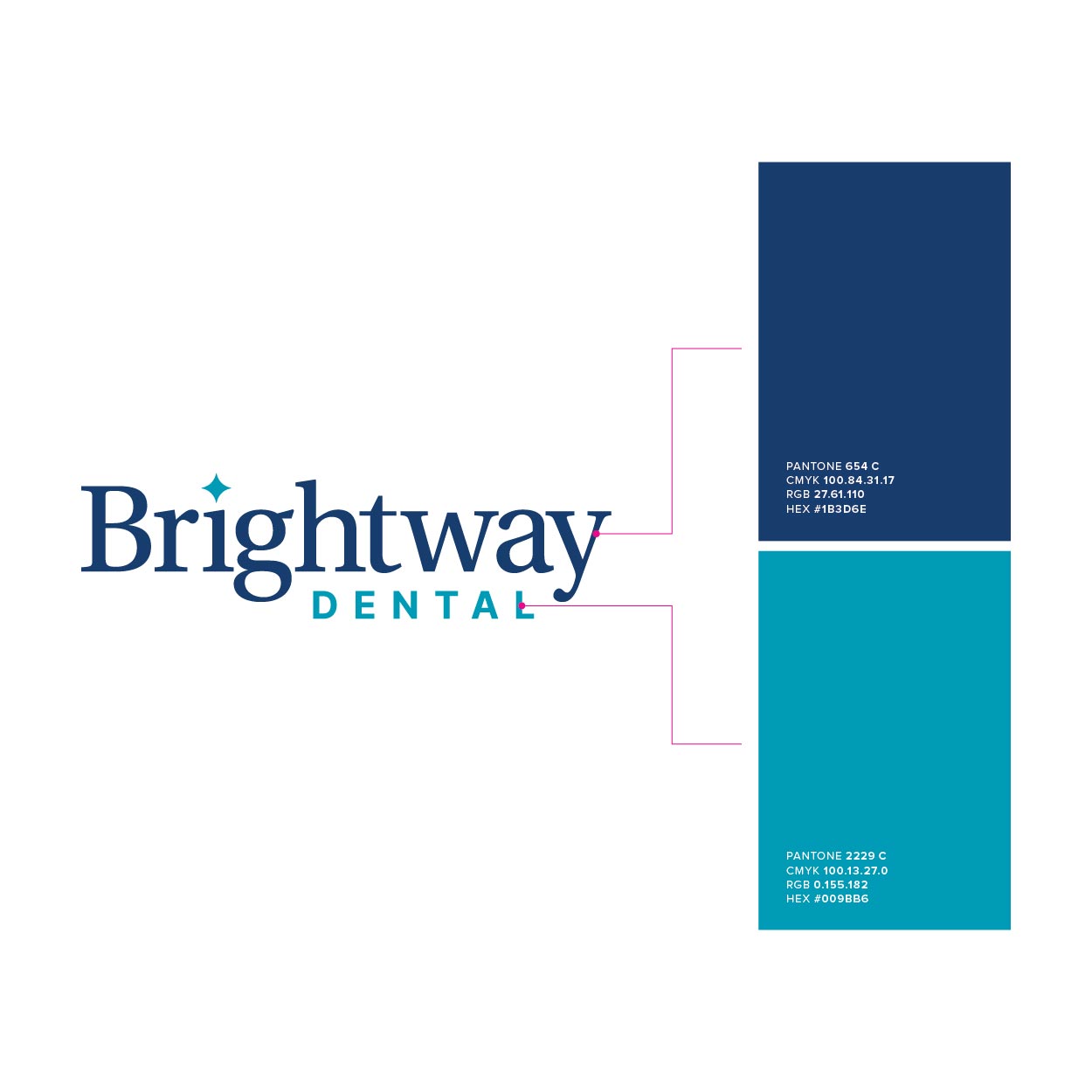
The Brightway Dental brand comes to life through thoughtful use of color, type, and layout. A bright blue paired with soft white conveys optimism and a sense of calm, core to the patient-first philosophy. The typography is clean and contemporary, chosen for both readability and approachability. Every element of the visual identity was crafted to feel cohesive and reassuring, whether it’s applied to digital screens, printed materials, or interior signage. It’s a full brand system designed to make every interaction feel consistent and welcoming.
Brand Guide & Standards