Brodstone Healthcare (formerly Brodstone Memorial Hospital) is an expanding healthcare provider, serving the needs of the greater Superior, Nebraska region. Its rich history, cornerstone foundation, and dedication to strategic planning made them an ideal partner to collaborate with the UNANIMOUS team for a comprehensive brand strategy.


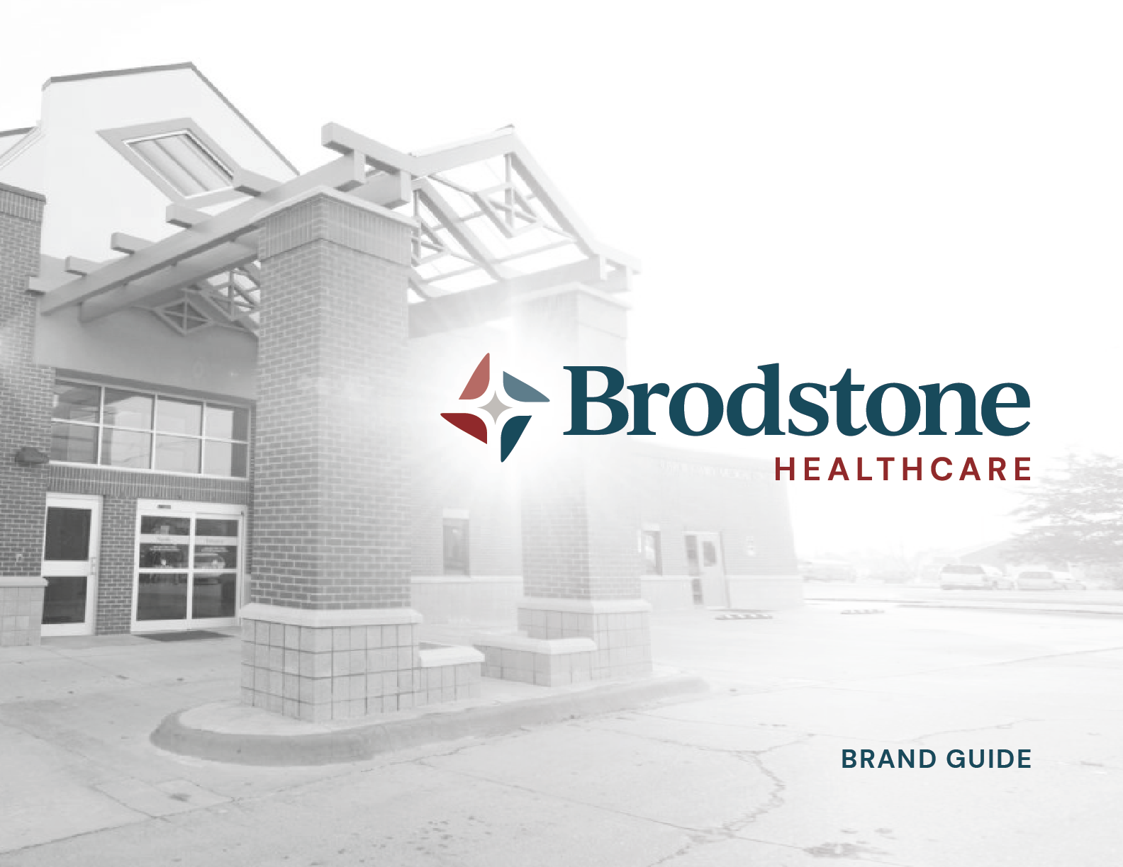
Brodstone Healthcare
Healthcare System Branding, Logo Design & Web Design

Healthcare Brand Design
Brodstone’s leadership embarked on a journey with the UNANIMOUS team to develop a strong verbal brand identity and visual brand identity to accurately represent innovative healthcare and facility expansion while creating an inclusive vision moving forward for all facilities, clinics, and partners.
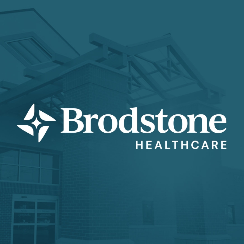
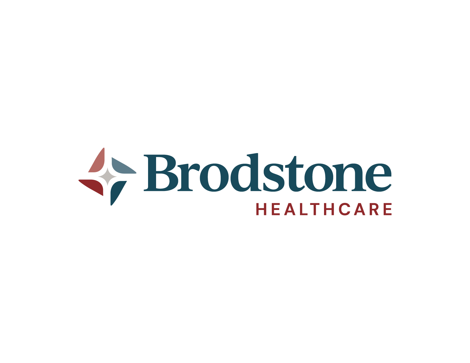
Brodstone Healthcare Logo
BEFORE
Brodstone Healthcare Logo
AFTER
Verbal Brand Identity Development
Understanding the value of a cohesive approach, we conducted unbiased market research, including patient, employee, and community member interviews. The research findings were documented and evaluated to establish a well-guided brand alignment strategy.
Well-established community support and Brodstone’s strong history laid the groundwork for fine-tuning the mission, vision, and values. Defining the tone and voice of a messaging platform allows key messages to be developed to pave the way for strategic and consistent external communication.

Visual Identity Design
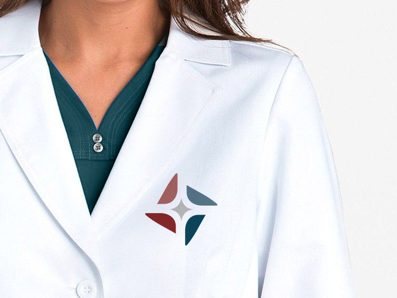
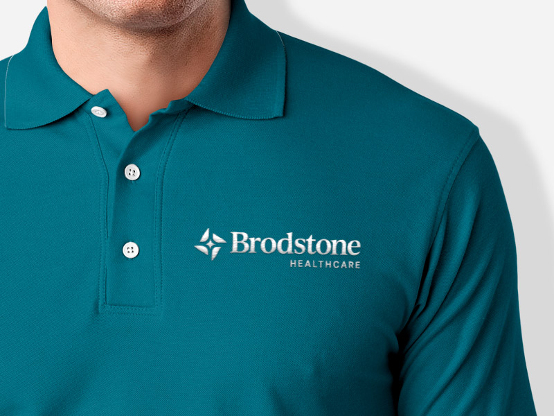
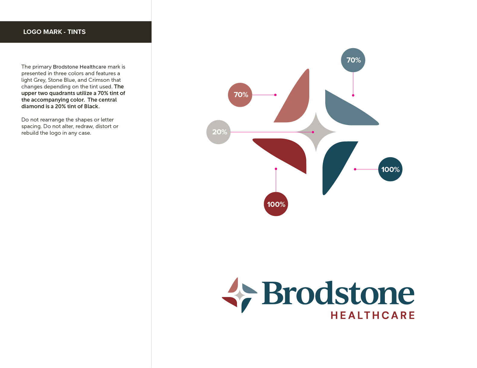
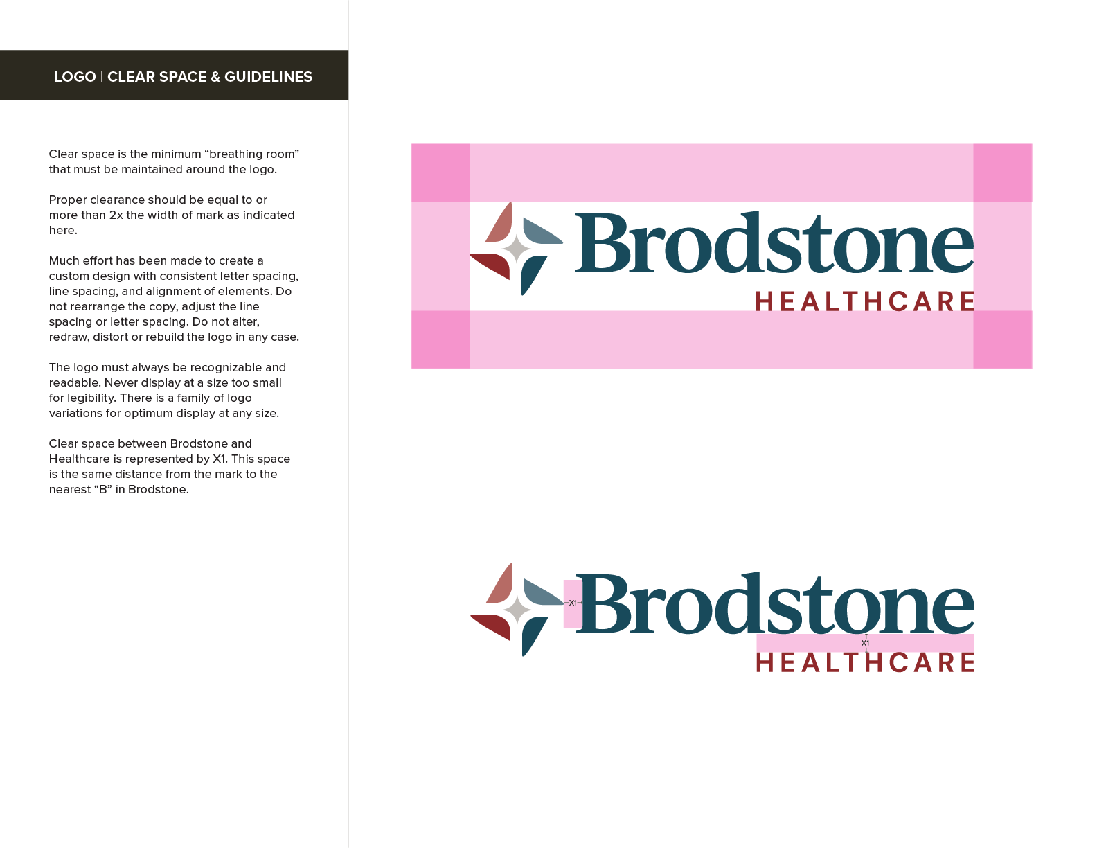
Capitalizing on a well-built foundational and verbal brand identity and acknowledging the tradition of their existing brand, the UNANIMOUS design team went to work to create a fresh and progressive mark to compliment branding considerations. Representing quality, growth, and pride was important for the brand to embody a sense of connection and community. The quadrants add an engaging aesthetic and could represent services/providers/patients all coming together within one organization.
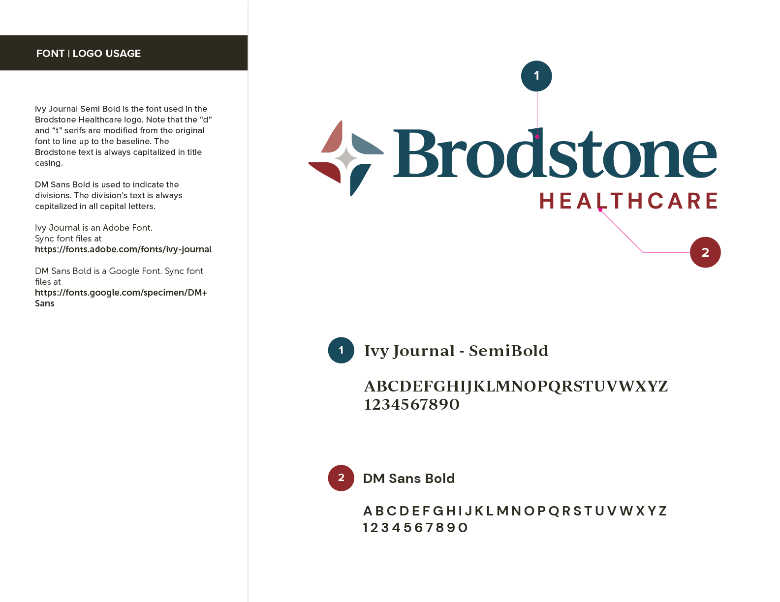
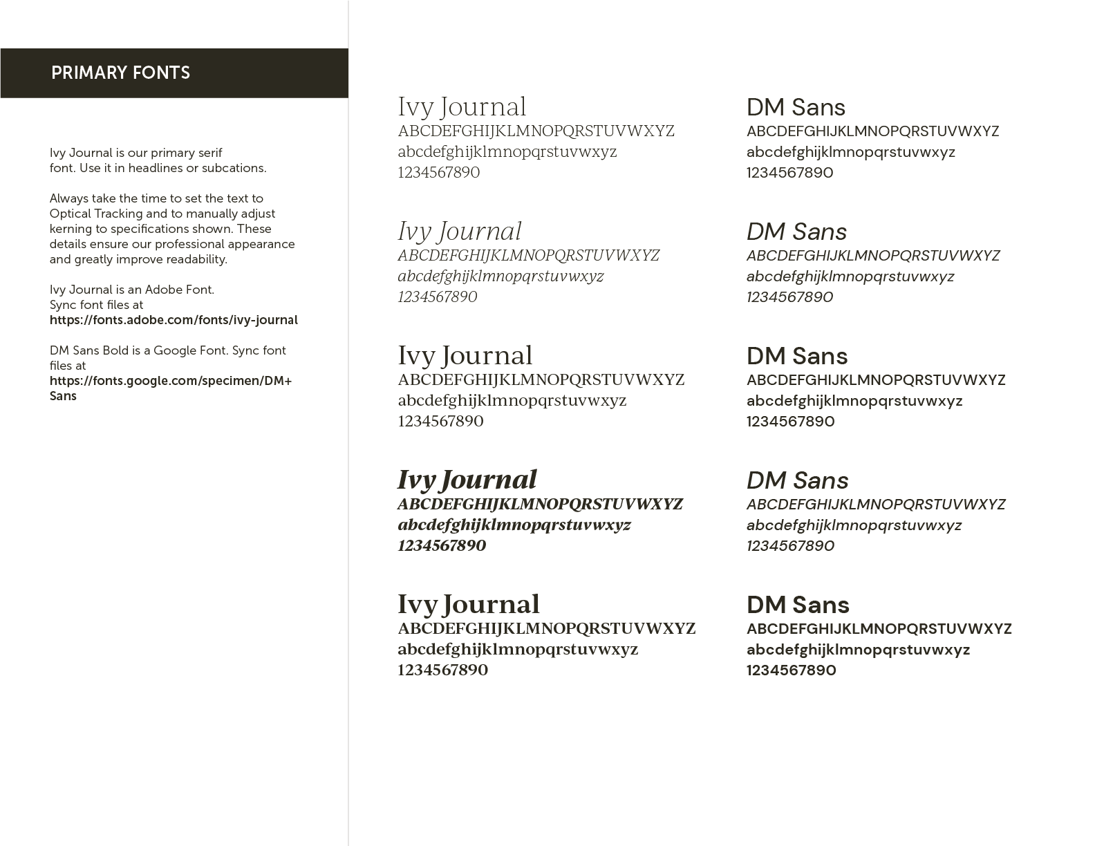
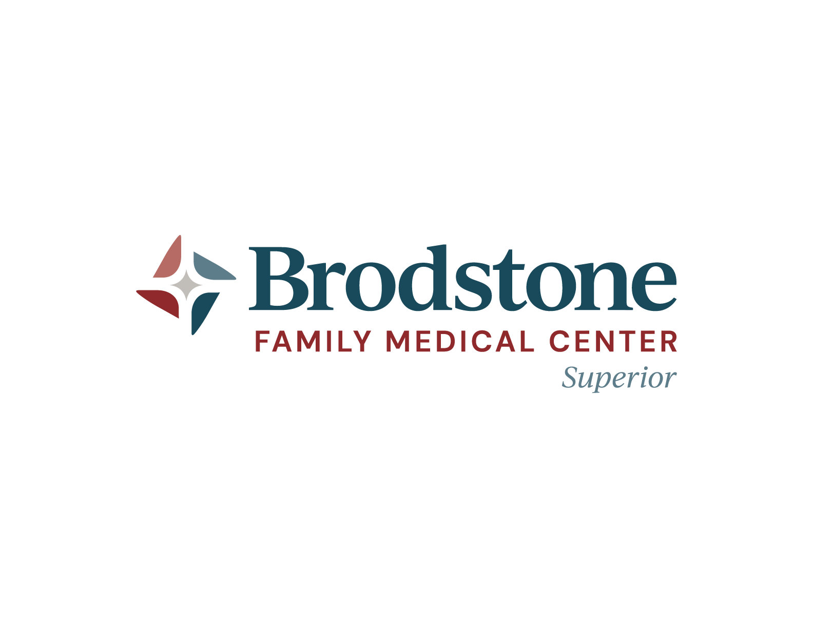
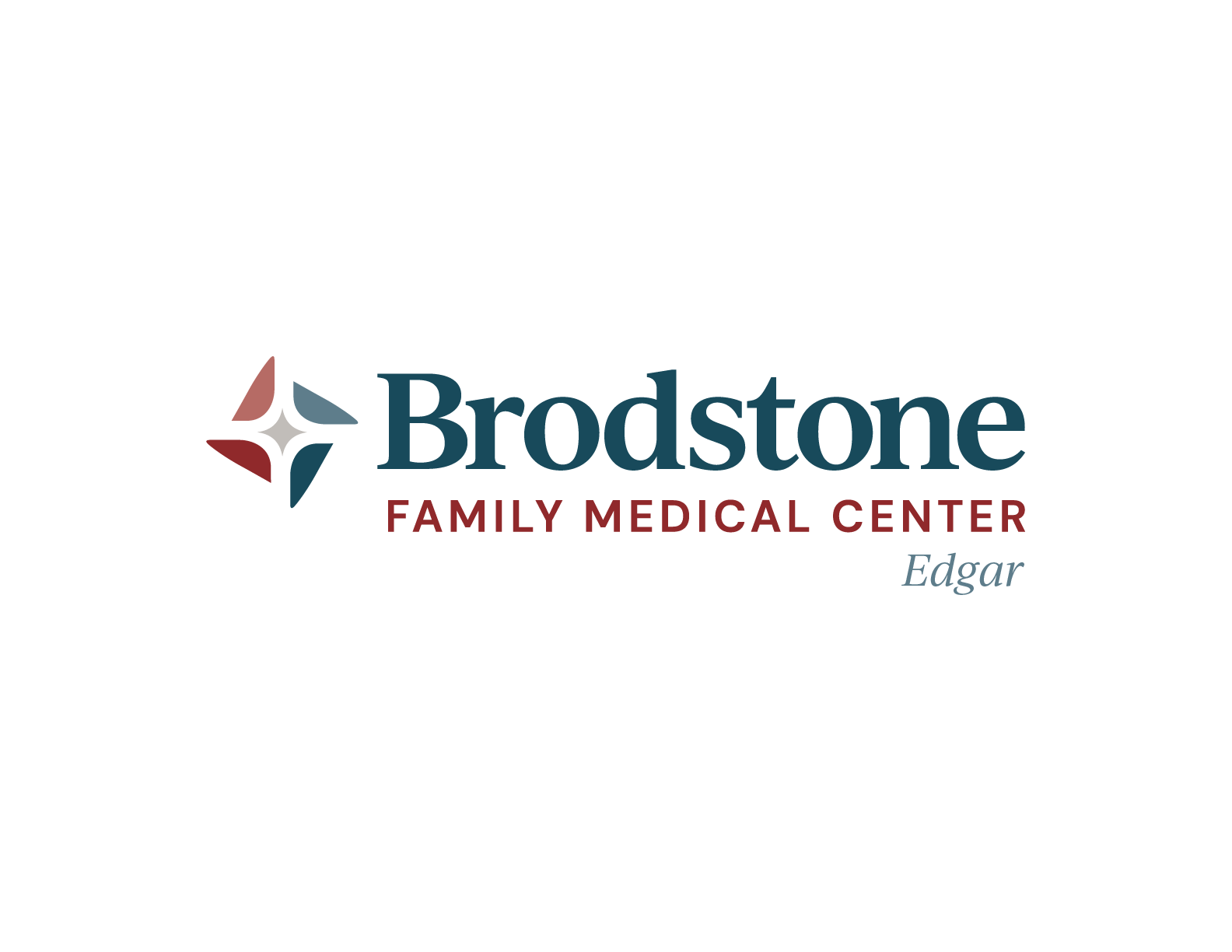
Brodstone simplified its naming structure to Brodstone Healthcare, allowing for a simplified approach to its brand architecture. It was important for the brand to extend to the foundation and the family health clinics in Superior, Nelson, and Edgar. We used a strong serif typeface for Brodstone while mixing in a san serif for a descriptor under the name.
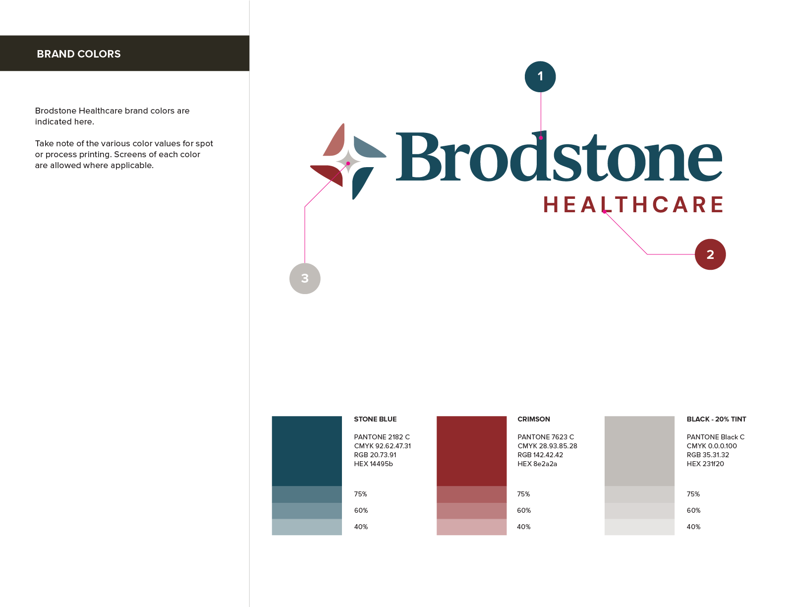
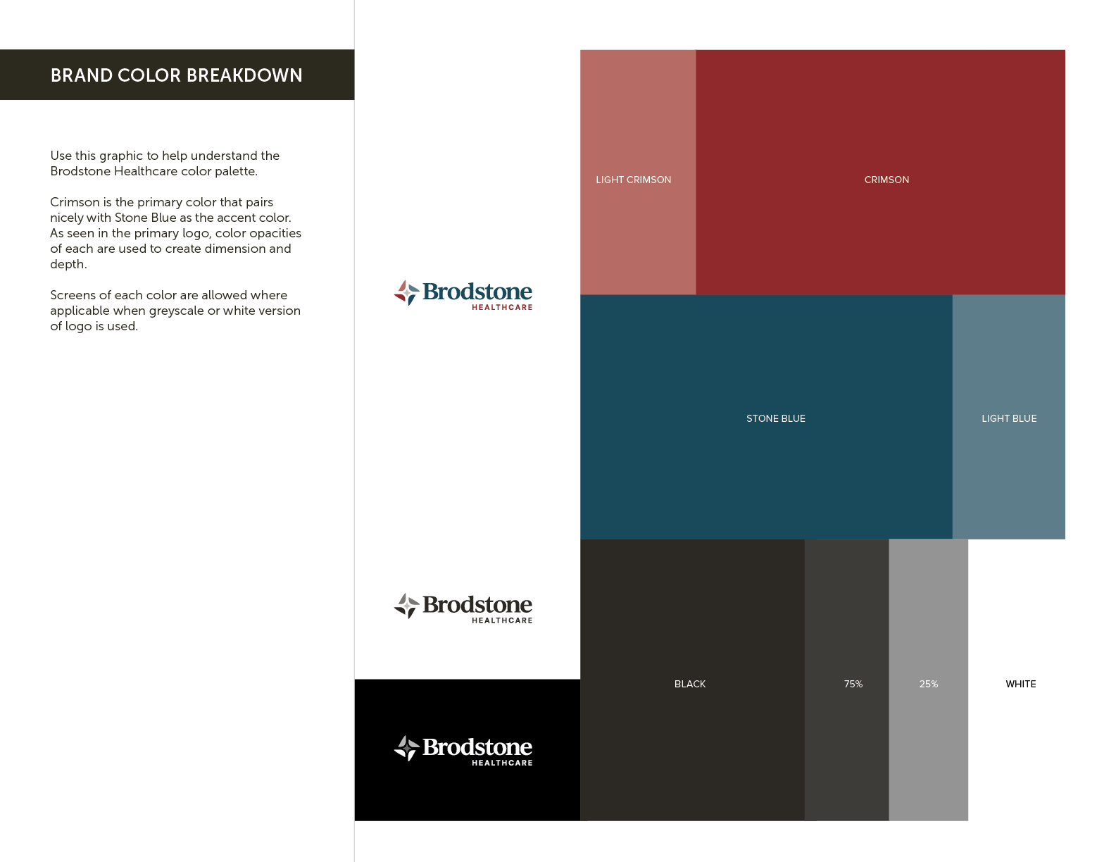
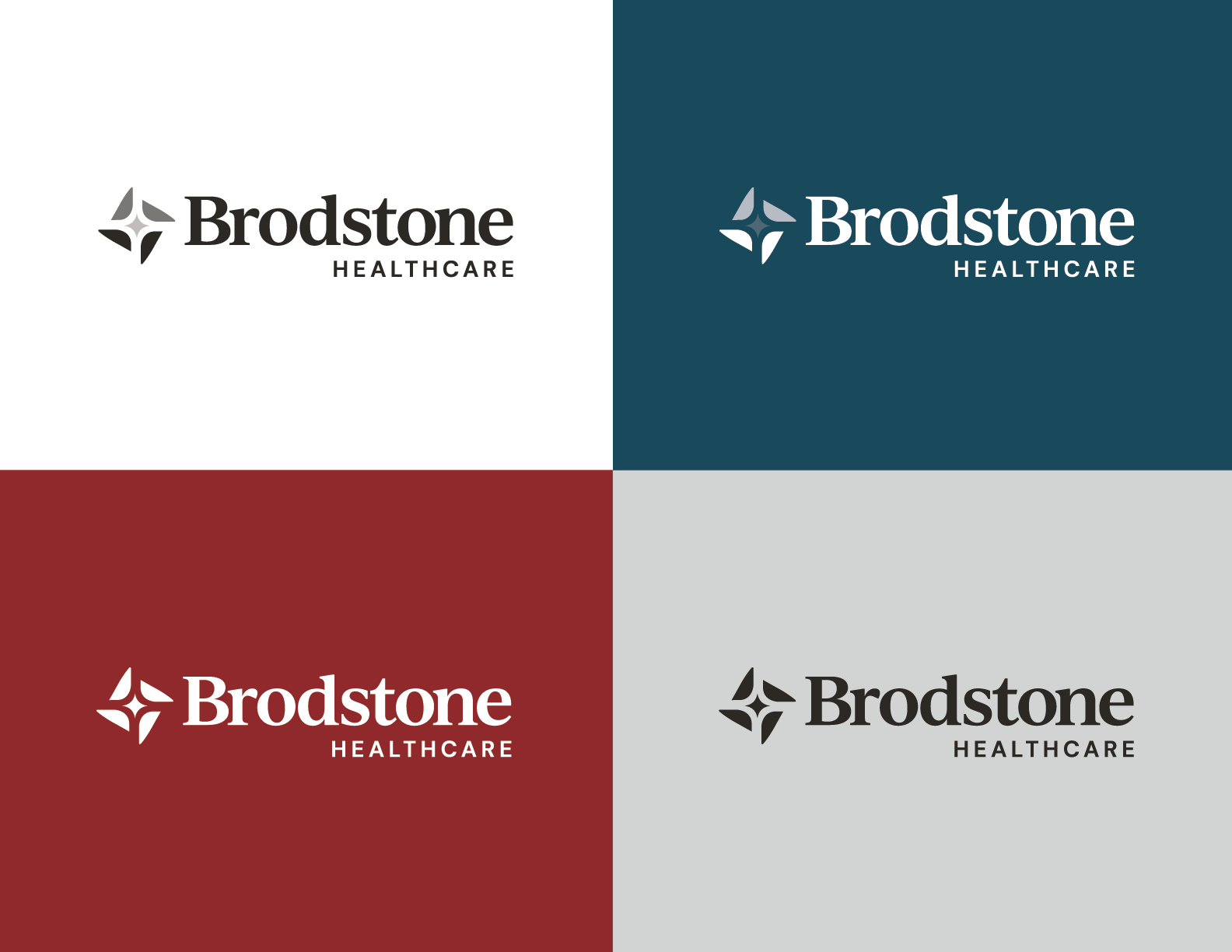
UNANIMOUS opted to keep the legacy “crimson” color as a connection to the previous brand but injected a secondary color, “stone blue,” to provide diversification and flexibility for the website and marketing collateral.


I'm really proud of the brand we have moving forward. It unifies us and identifies us as a beacon within the communities we serve. UNANIMOUS brought so much to the table during the rebrand, we know we have a true partner that gives us flexibility and opportunities to make an impact in our area.
Treg Vyzourek
CEO, Brodstone Healthcare
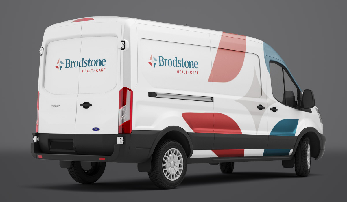
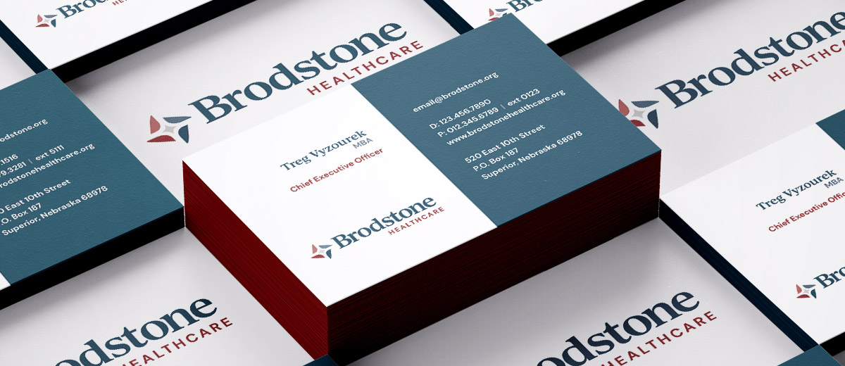
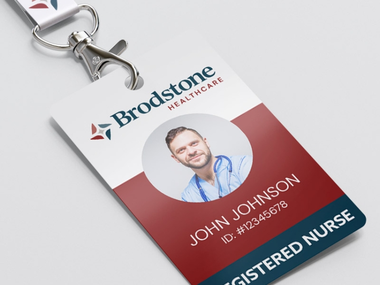
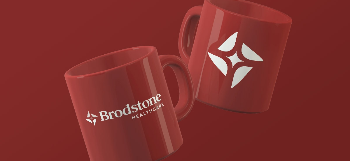
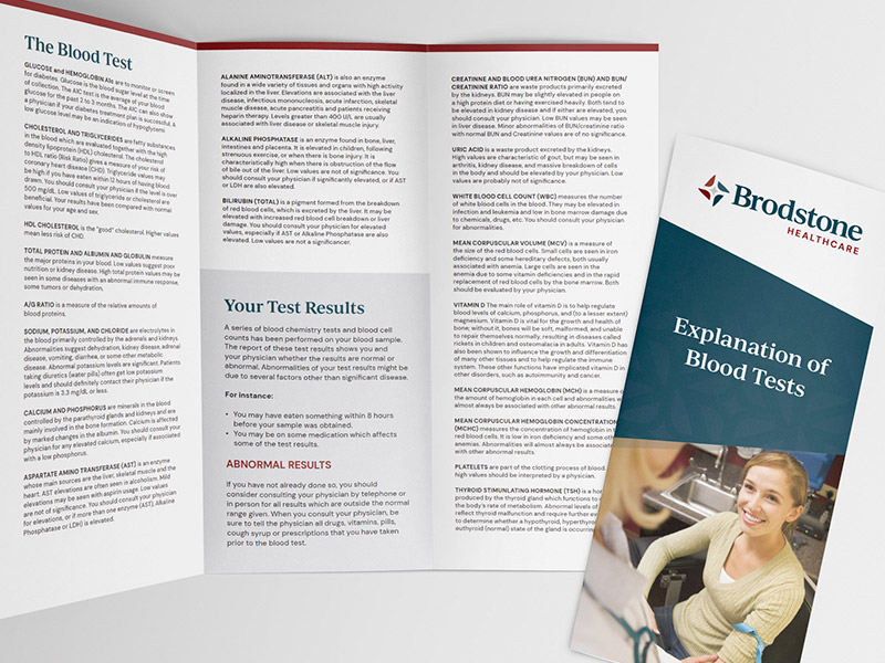
Brodstone Healthcare Branded Collateral Design
UNANIMOUS also assisted in developing and updating internal and external brand materials, such as business cards, letterhead, banners, brochures, and more.

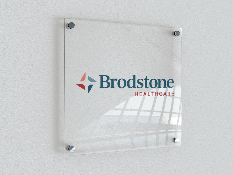

Healthcare Brand Standards & Guidelines
A healthcare organization's brand standards are important because they help create a cohesive and consistent brand image for the healthcare organization. Brand consistency is important because it builds trust and credibility while establishing a perception of higher quality. A brand that is managed and maintained well will create pride in the organization and the community it serves.

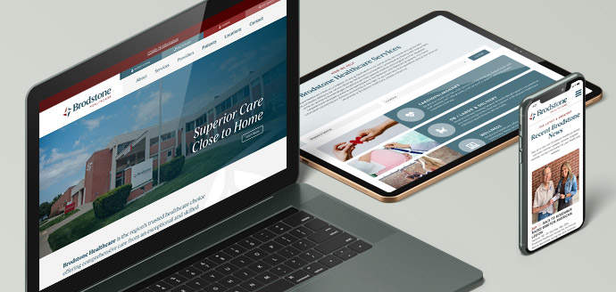
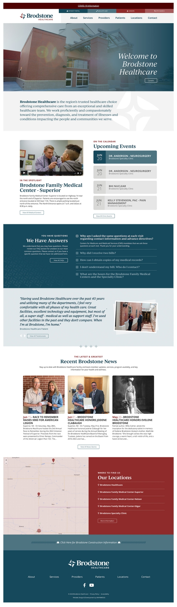
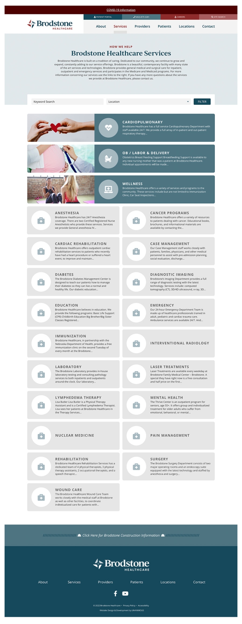
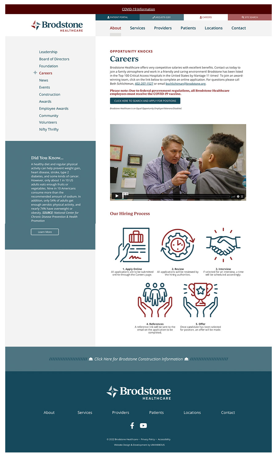
Website Design & Development
Bringing all brand elements into succinct alignment, the website design and development team set forth to enhance the user experience with a responsive, visually appealing website.
Healthcare Brand Video Production
It was important to have video assets that captured and conveyed the emotion, focus, and elements of the new Brodstone Healthcare brand. UNANIMOUS produced two videos as part of this project.
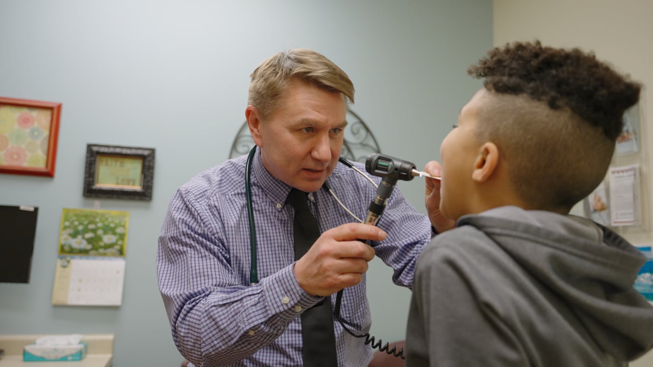
Short-Form Brand Video
This two-minute brand video introduces the new brand to employees and the community. This video needed to be timeless so that it could be used as a marketing and recruitment tool beyond the initial launch of the new brand.
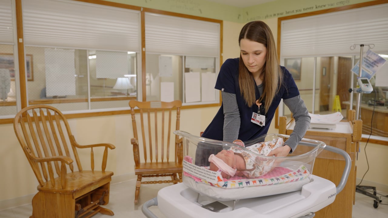
Long-Form Brand Video
UNANIMOUS also produced a second long-form employee onboarding video. This video conveys the excitement, enthusiasm, and team atmosphere of Brodstone Healthcare to new staff and employees.