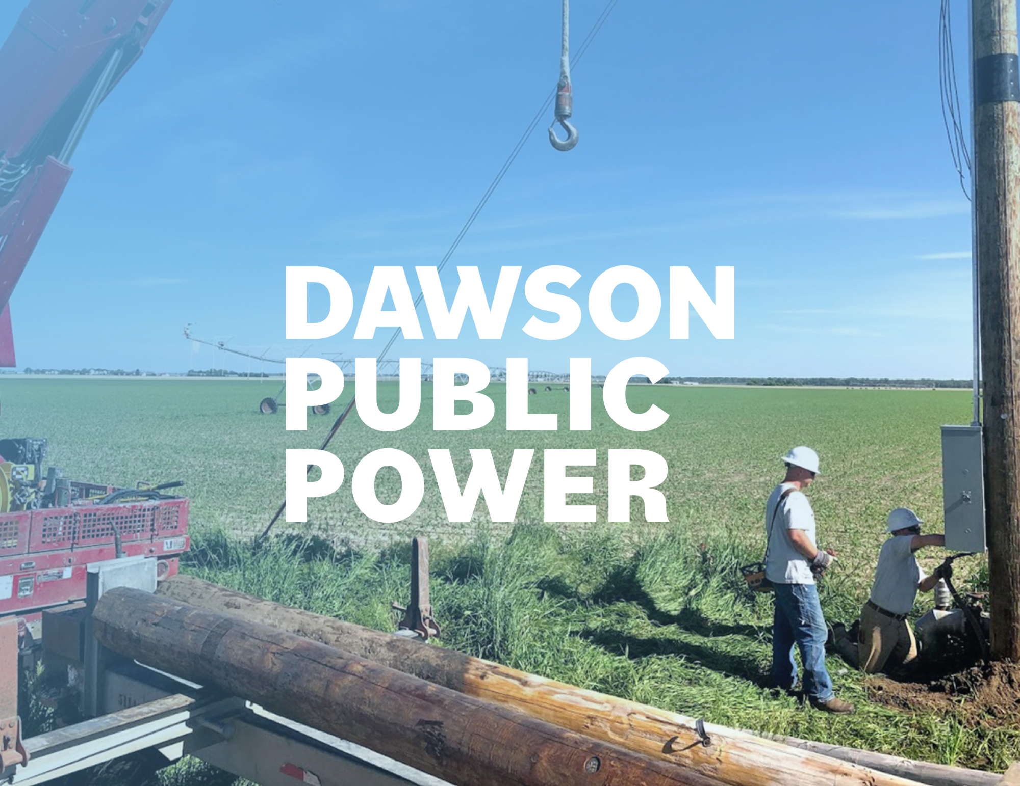
Two Two Dawson Public Power workers, wearing hardhats, working out in the field
Dawson Public Power Stacked Logo in White

Dawson Public Power

Utilities Visual Identity

Dawson Public Power is a publicly owned electric utility serving farms, homes, and businesses across south central Nebraska. UNANIMOUS, a brand identity agency in Lincoln, NE, partnered with Dawson Public Power to refresh its visual identity through logo design, a cohesive visual brand system, and comprehensive brand standards. Built for clarity and versatility, the updated identity honors the district’s history while creating a consistent, confident look for the future.

Dawson Public Power Logo
BEFORE

Dawson Public Power Logo
AFTER

Logo Design

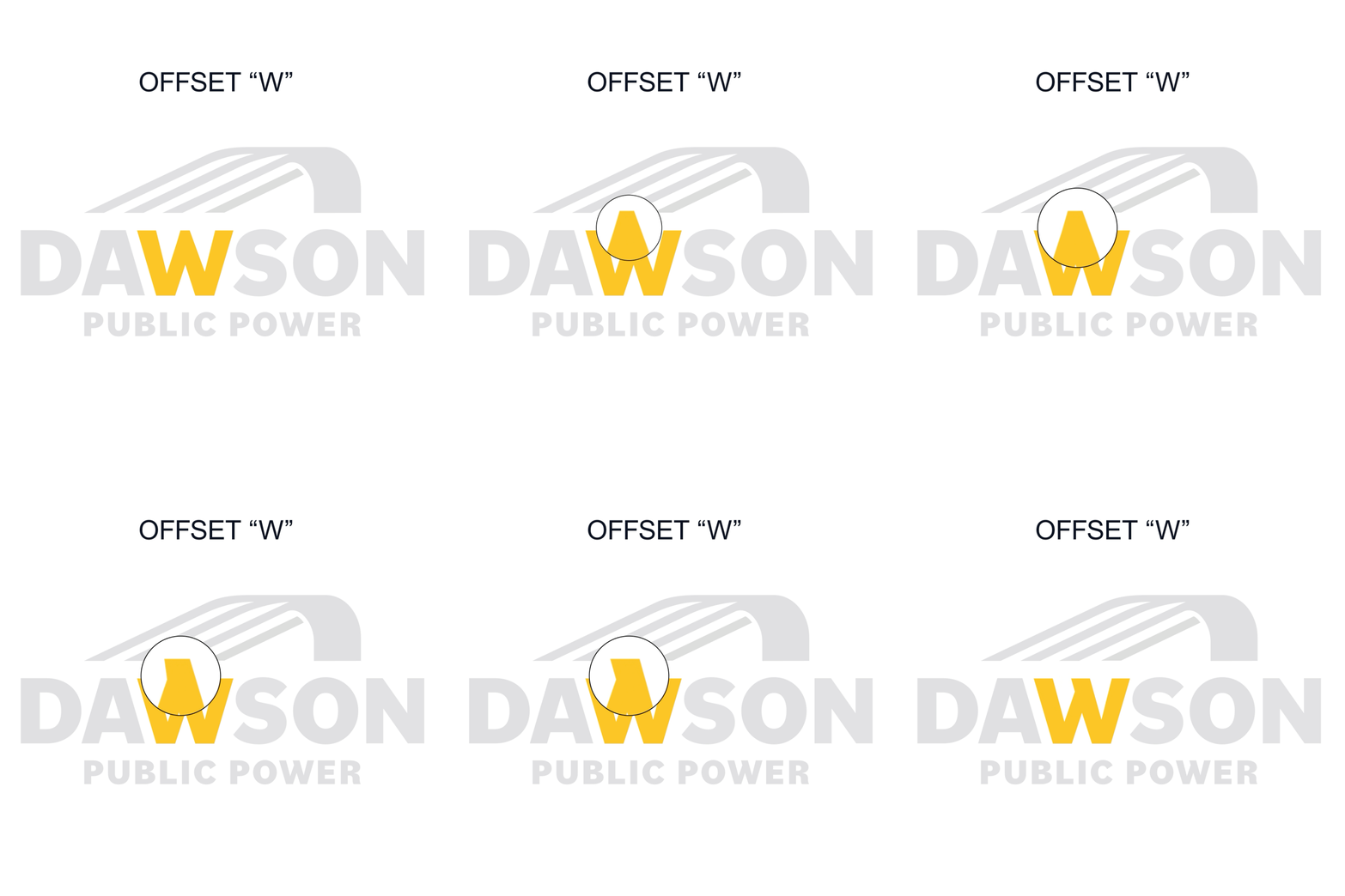
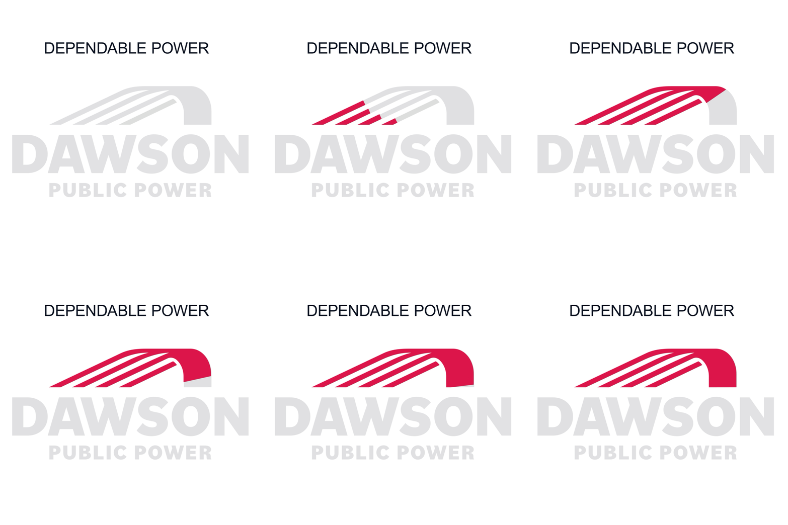
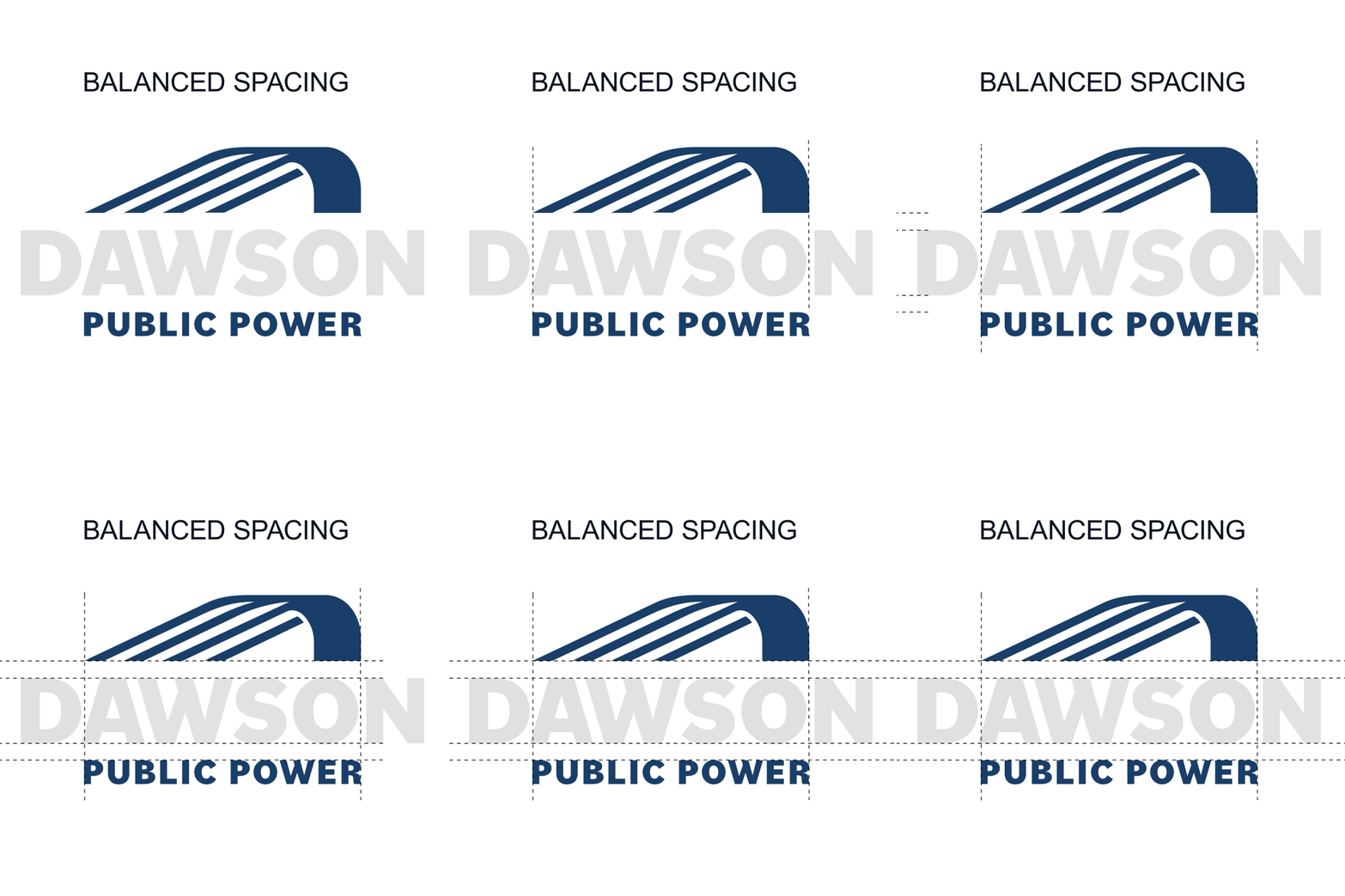
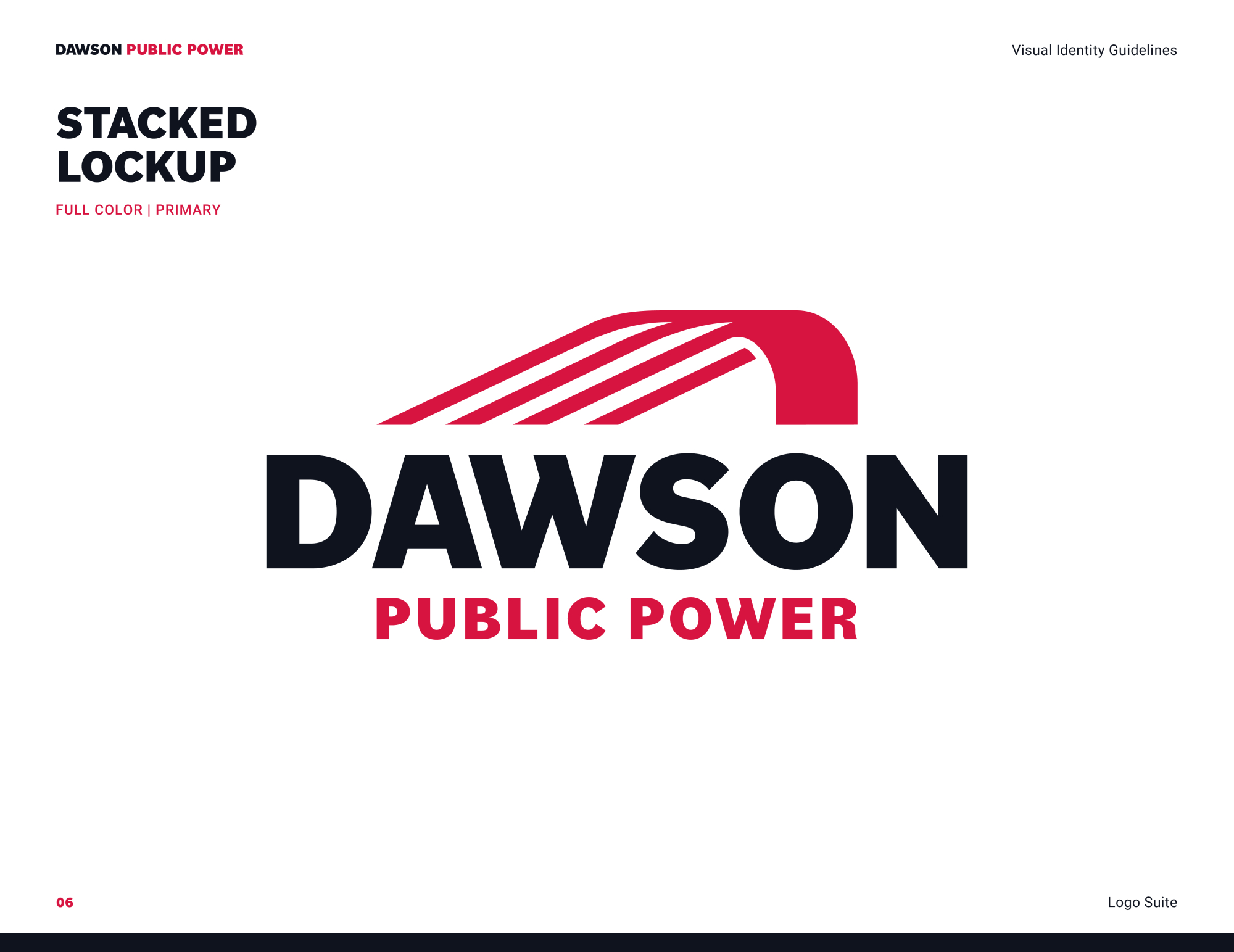
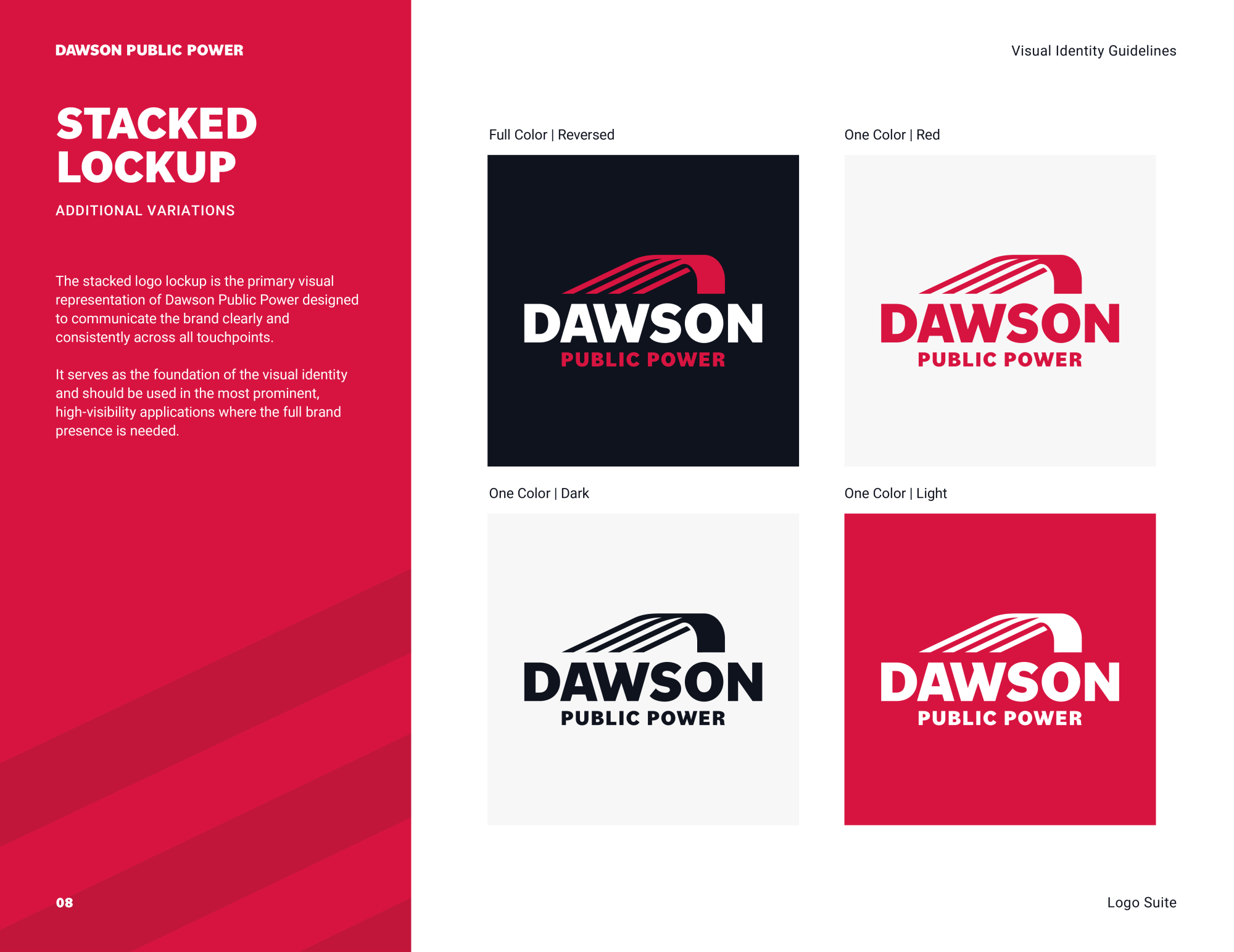
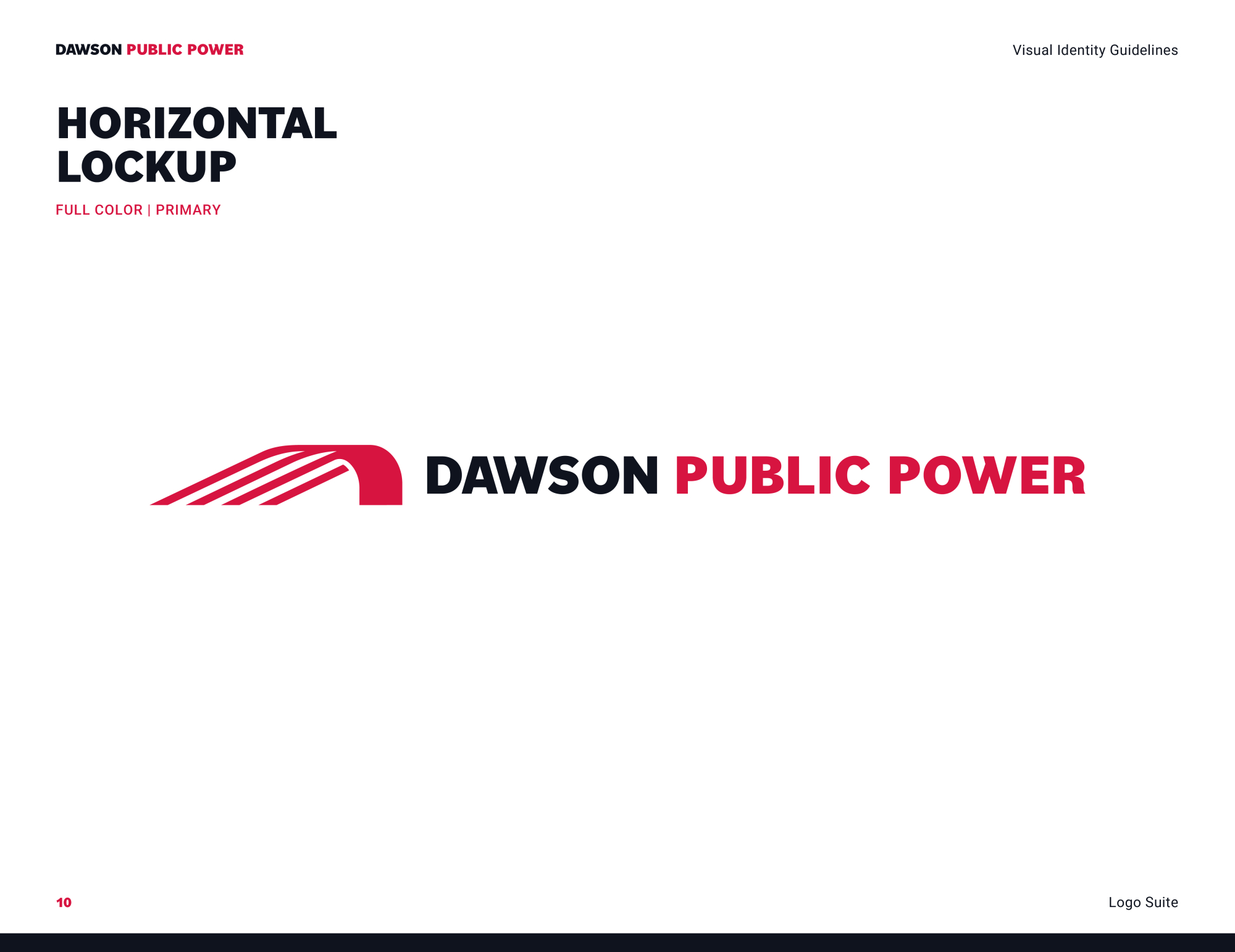
The refreshed Dawson Public Power logo builds on the equity of the district’s original identity while giving it a cleaner, more contemporary presence. The distinctive “W” from the original logo was modernized to preserve a recognizable connection to Dawson Public Power's history. “Public Power” is carefully scaled to align with the width of the primary wordmark, creating a balanced and unified composition.

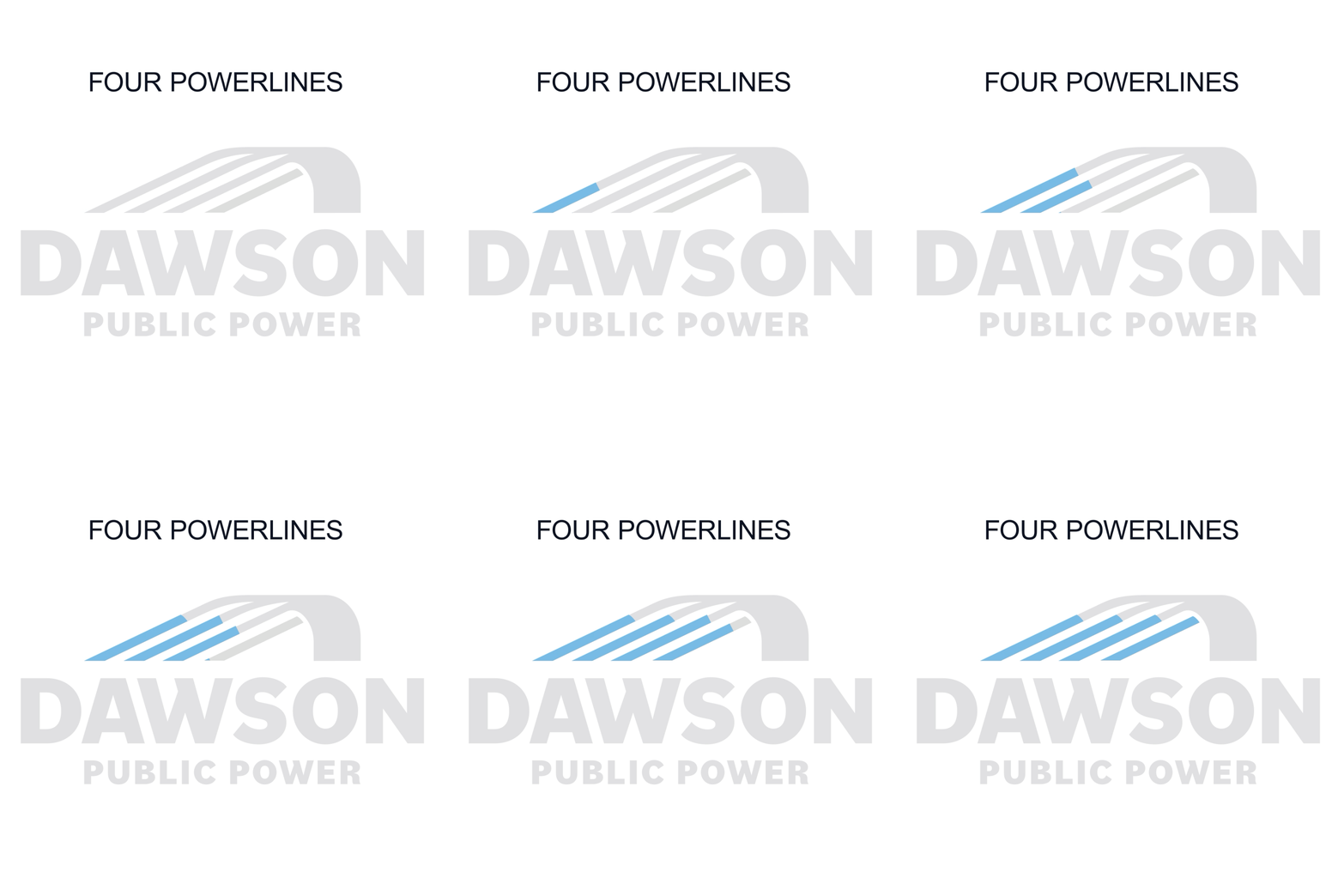
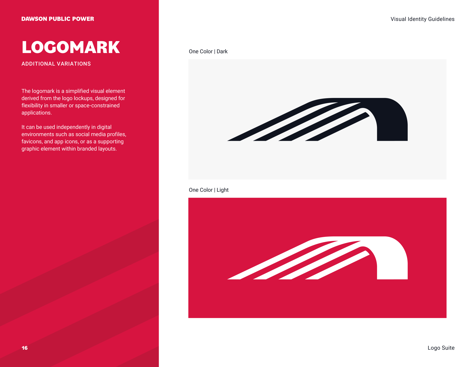
Four lines within the mark reference the four lines featured in the original logo. As they move through the symbol, the lines curve together and become one solid form, representing energy in motion becoming dependable power. The result is a meaningful evolution of the Dawson Public Power identity that honors where the organization has been while creating a strong, versatile mark for the future.
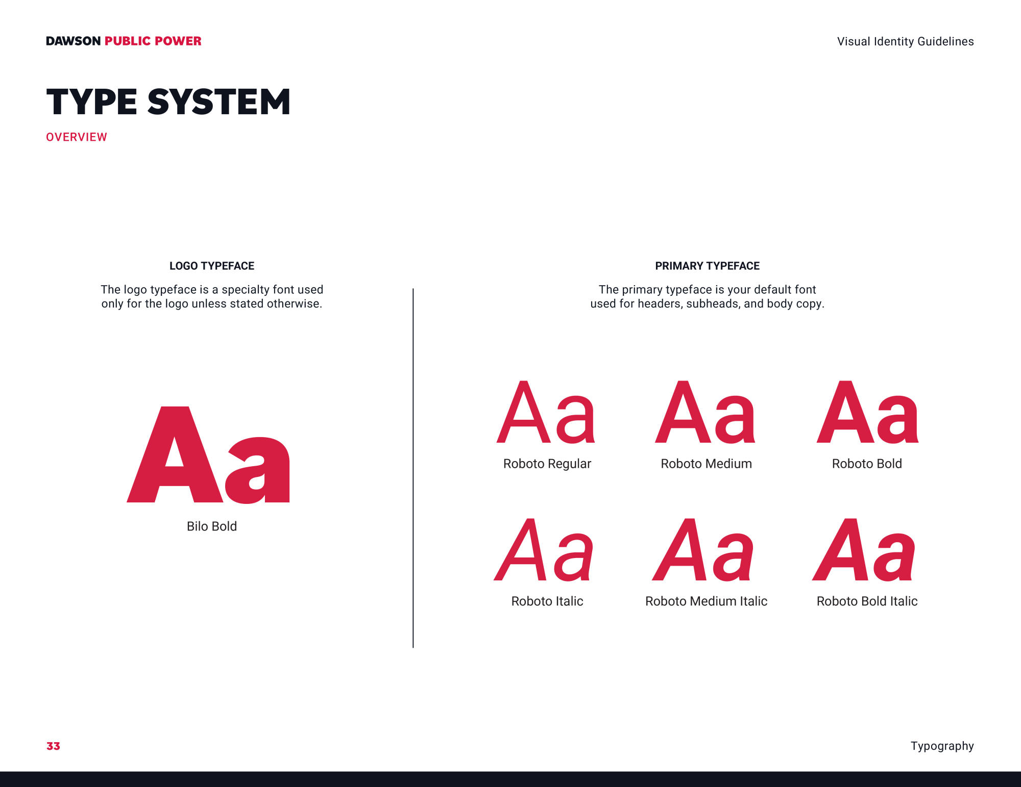
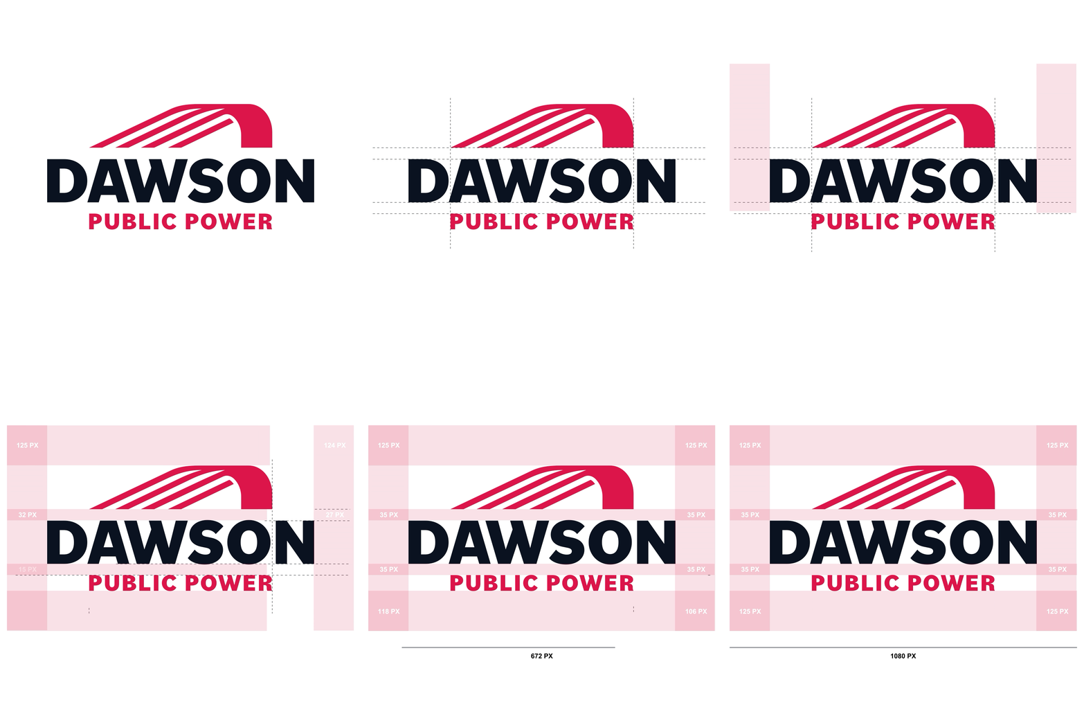
Dawson Public Power Spacing Showcase

Visual Brand Identity

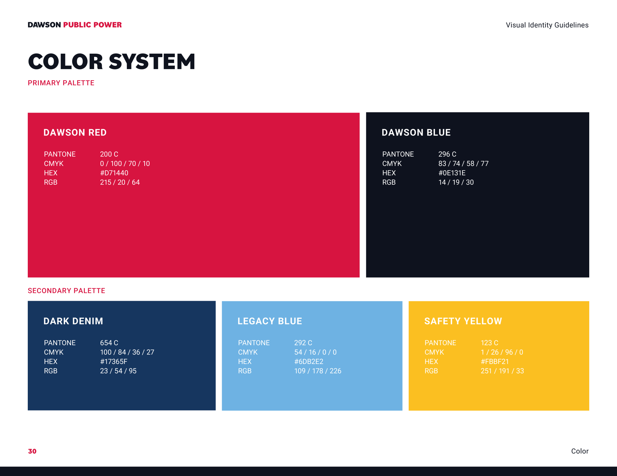
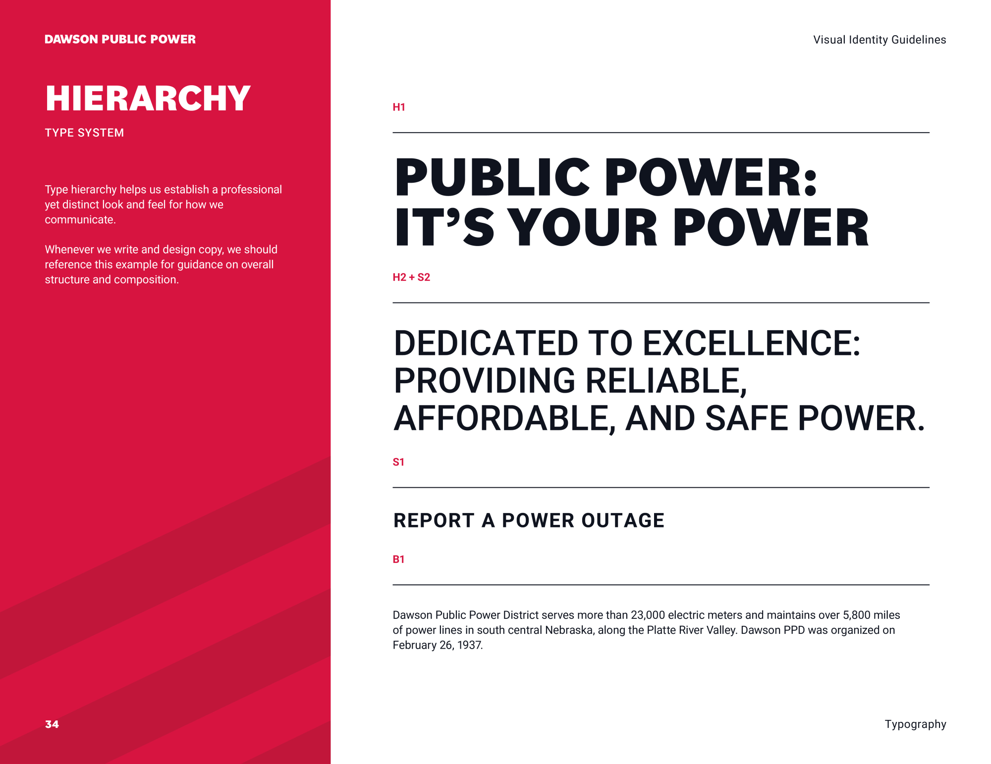
The logo became the foundation for a complete visual identity design system. UNANIMOUS developed a coordinated color palette, typography system, graphic elements, and supporting design treatments to give Dawson Public Power a recognizable presence across every brand touchpoint. The updated system creates consistency while giving the organization enough flexibility to communicate across a wide range of applications. From customer communications to operational materials, every element works together to reinforce a professional and dependable public power brand.

Brand Guide & Standards

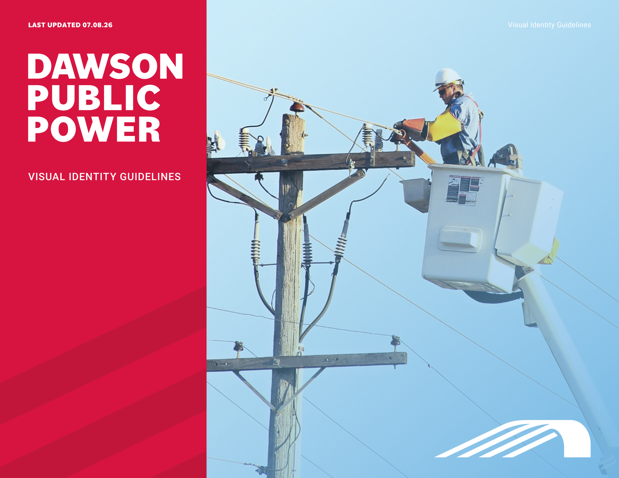
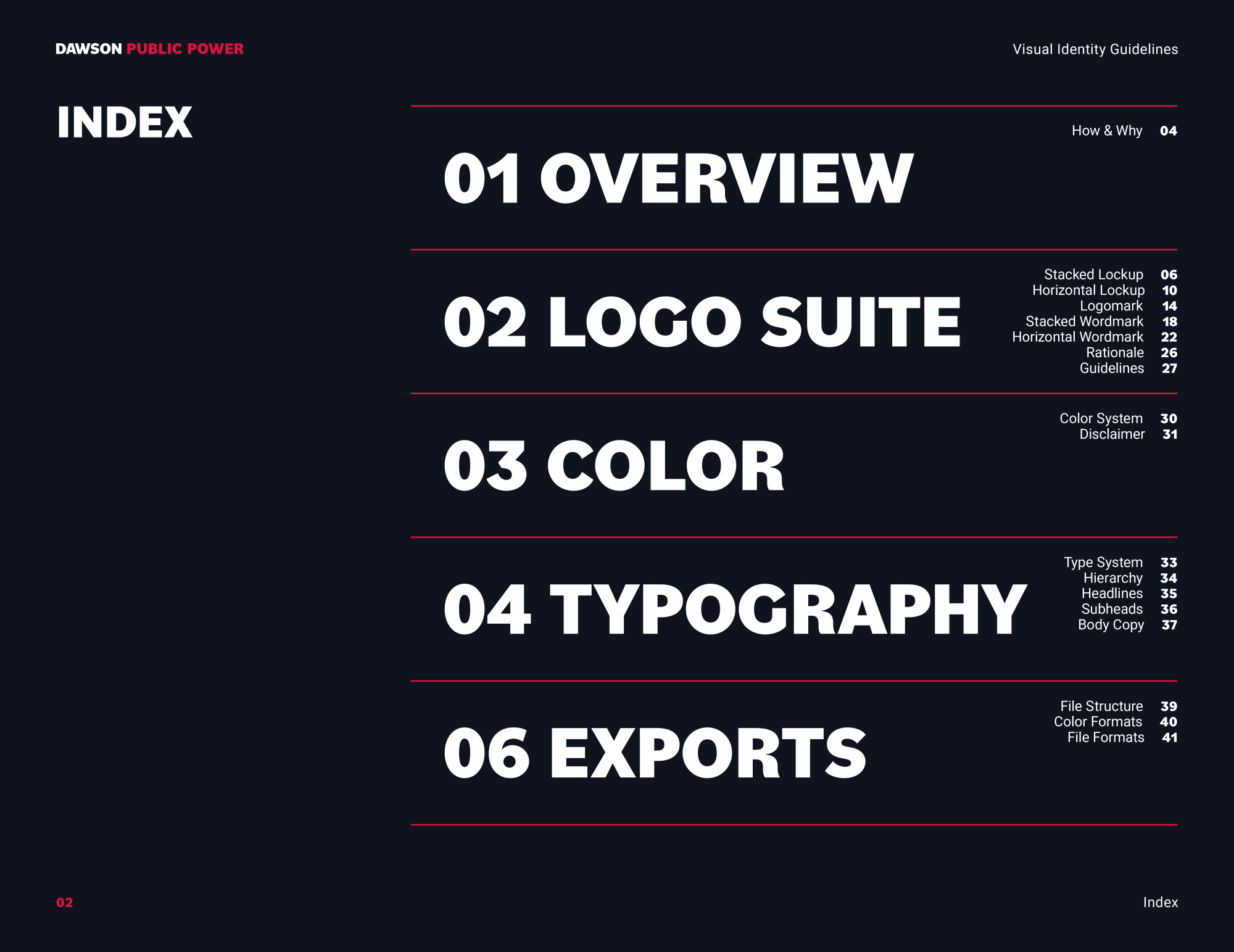
To protect the integrity of the new identity, UNANIMOUS developed a comprehensive brand style guide for Dawson Public Power. The guide establishes standards for logo usage, color specifications, typography, graphic elements, and supporting visual applications. These brand guidelines give Dawson Public Power staff, vendors, and partners a practical resource for maintaining consistency across print, digital, environmental, and promotional materials.

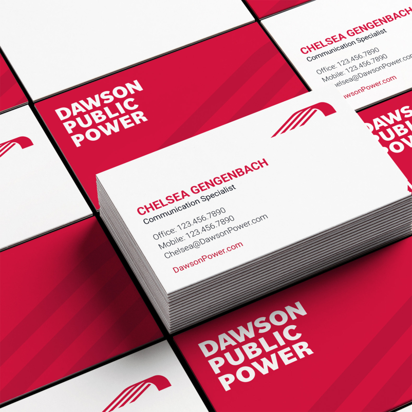
Dawson Public Power Collateral Business Cards
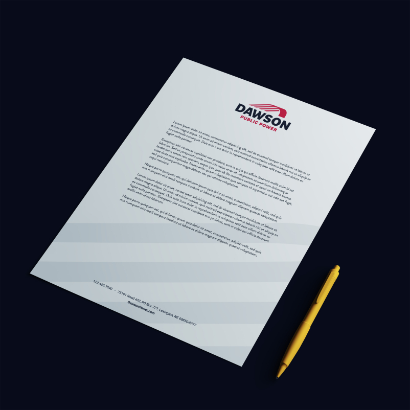
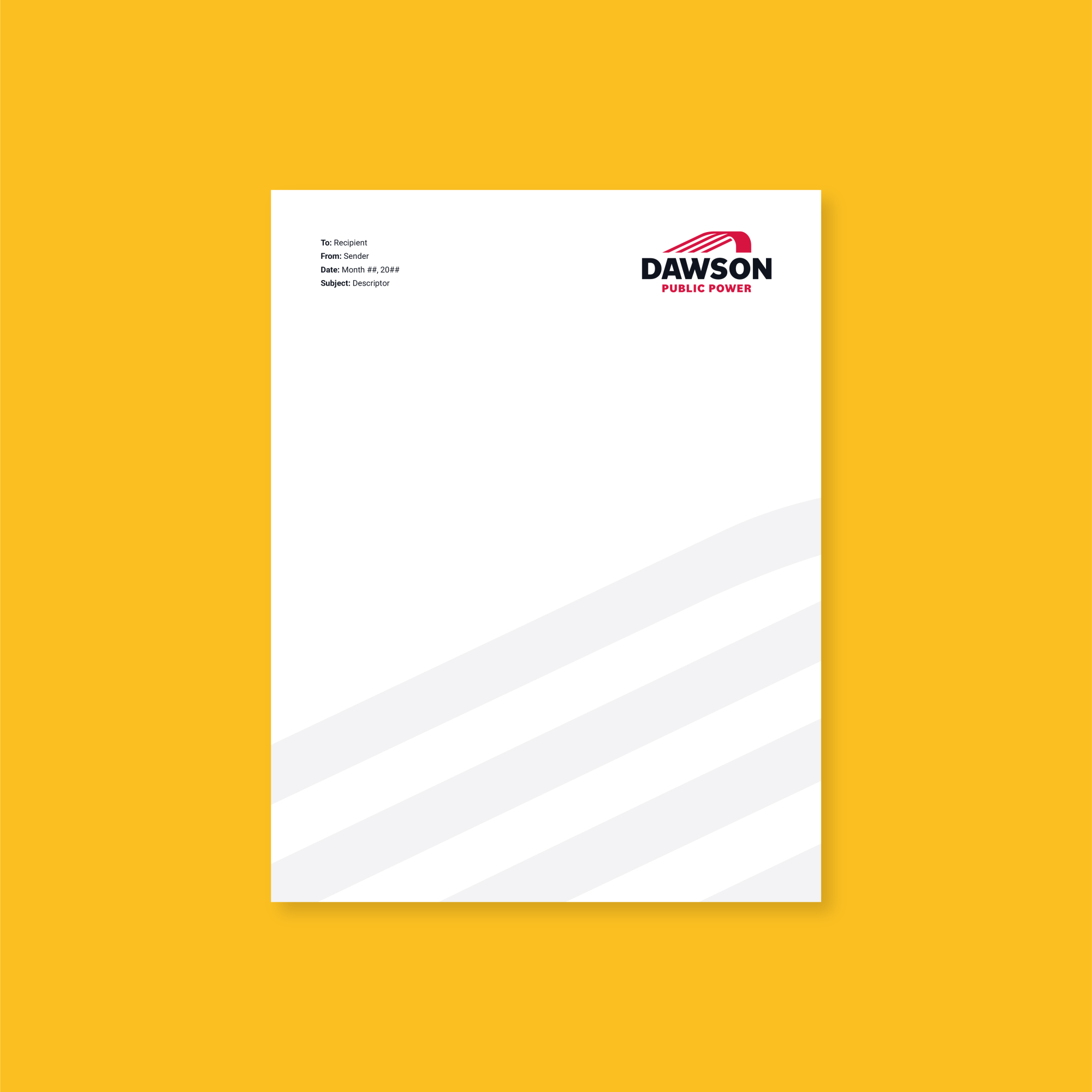
Dawson Public Power Collateral Letterhead

Professional Design Support

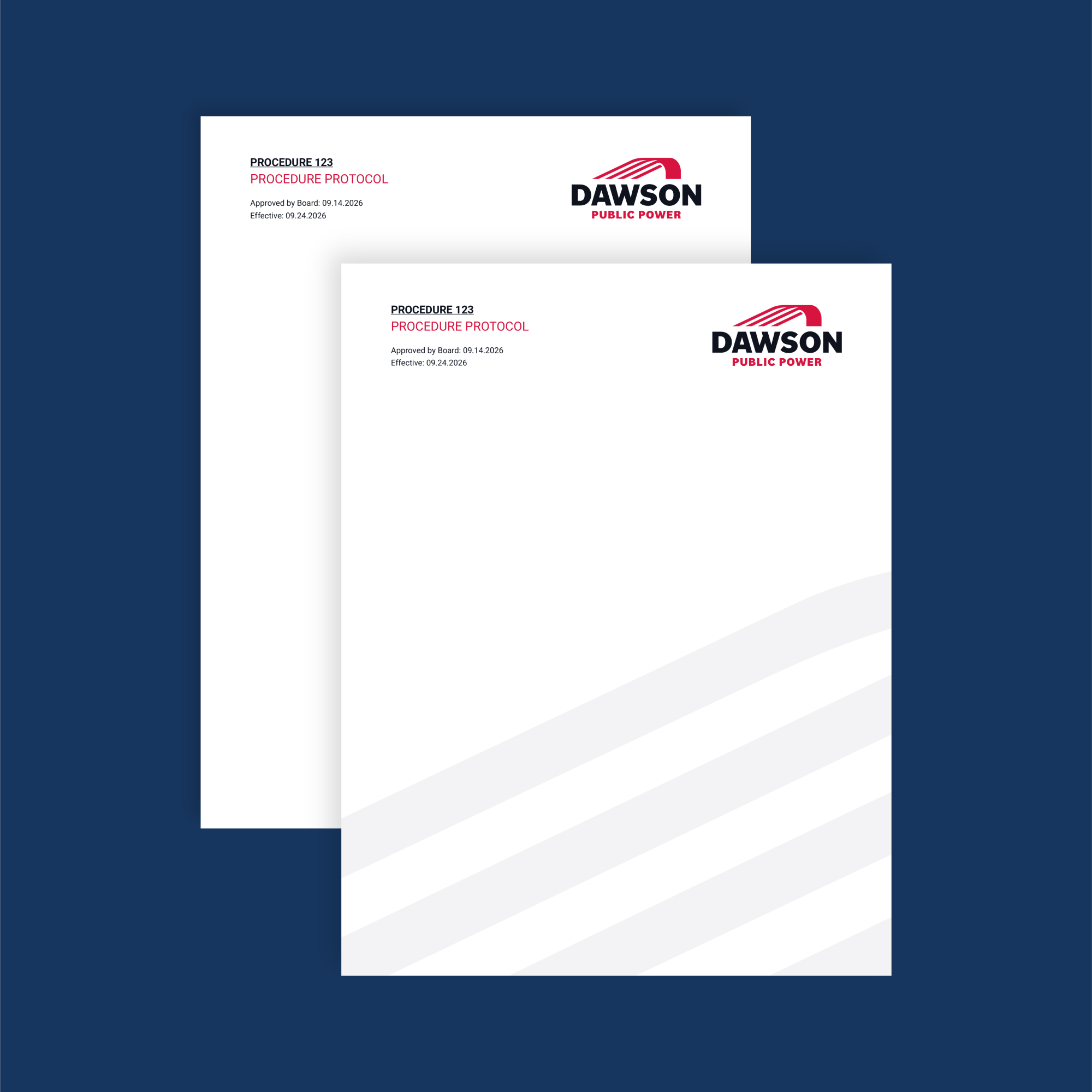
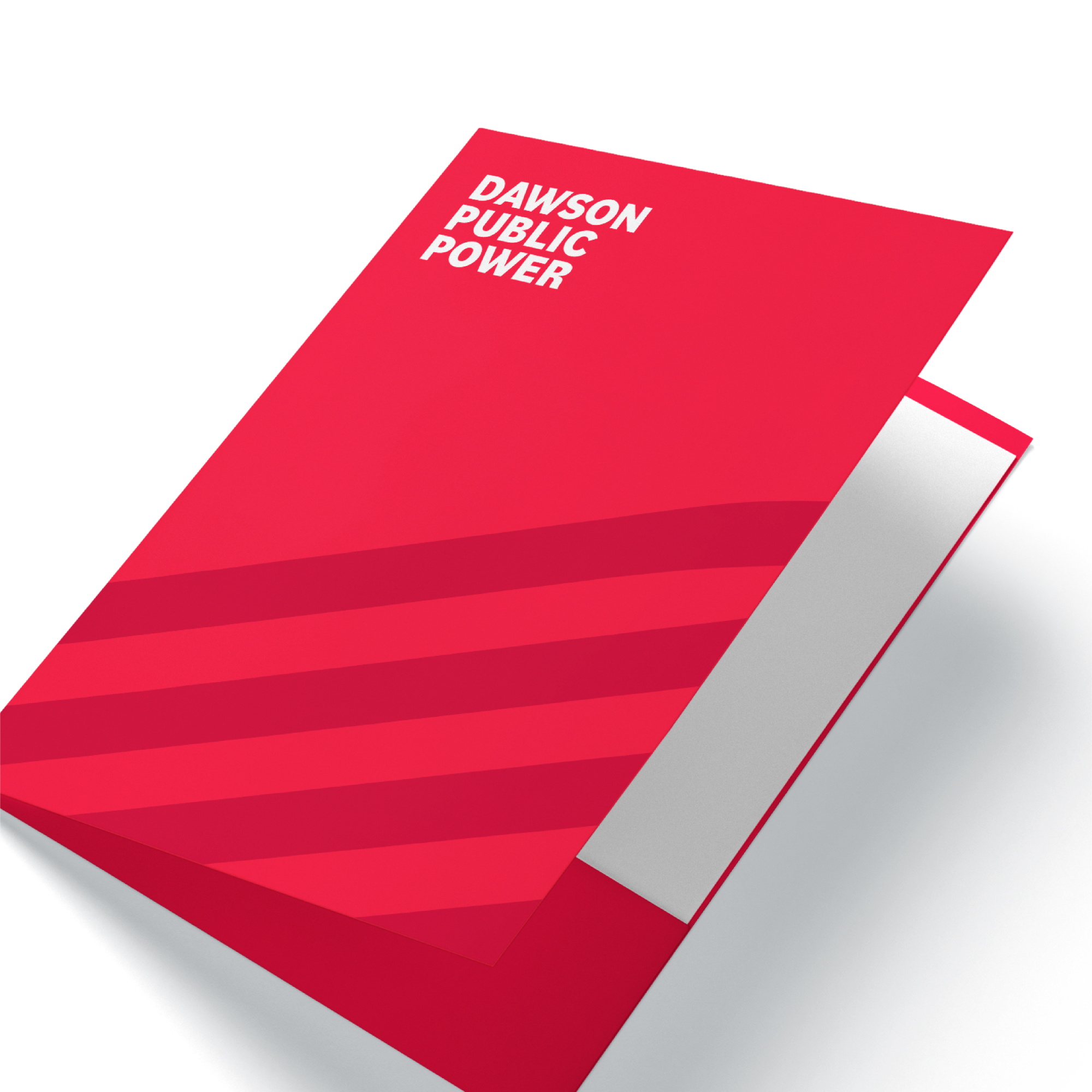
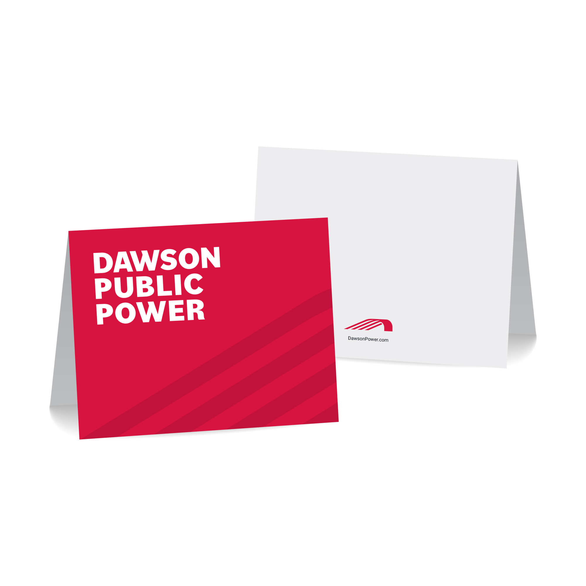
With the new identity established, UNANIMOUS extended the visual system into a coordinated suite of everyday communication materials. The collateral kit included business cards, letterhead, notecards, presentation folders, and a policy template. Each piece reinforces the Dawson Public Power brand while giving staff practical, professional tools for communicating consistently with customers, partners, and communities across the district.